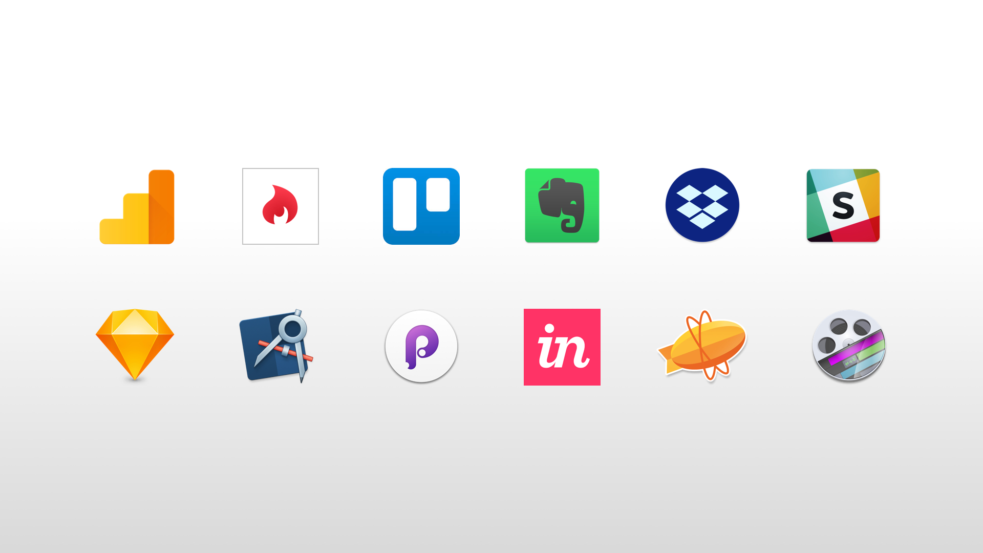
I've been creating UX prototypes for years and depending on what I've needed to convey to other team members, I've used all manner of tools from Fireworks, OmniGraffle and Axure to Bootstrap, WordPress and Foundation.
After reading numerous articles and speaking to several colleagues, I've recently moved the majority of my UX/UI design workflow over to Sketch (despite some bugs its still a great app with tonnes of plugins).
At the same I've also been using tools such as InVision and Marvel to put together basic, clickable walk throughs. But I wanted to dig a bit deeper and improve my hands on knowledge of interaction design, so I decided to have a look at Framer Studio.
NB: This post isn't meant to be a primer for Framer Studio, there are loads of good resources on the Framer website where you can learn the basics.
InVision Now UI Kit
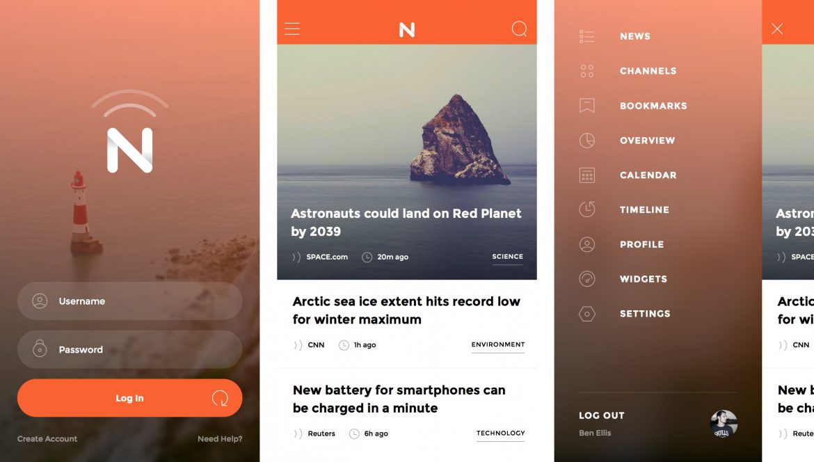
I started by downloading the awesomely free Now UI Kit from InVision. I didn't really have a plan for what I was going to prototype, so I just picked a few random mobile screens from the Sketch file (login, home and off-canvas navigation) and got stuck in.
Framer Studio
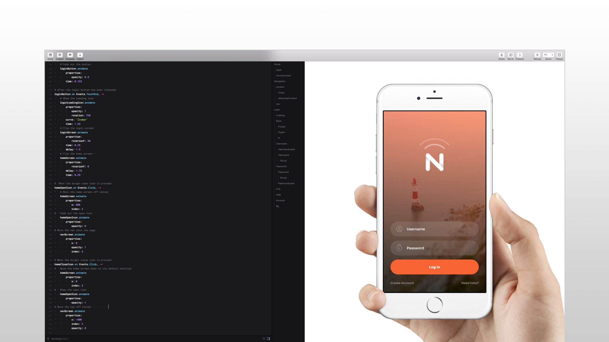
I then opened up Framer Studio, set the viewer to iPhone 6 (as this is the smartphone I have), fired up Frameless App on my device (for testing) and just started playing around with different animation settings (colour saturations, scale, opacity etc.).
Code logic
My code logic went something like this:
- First I set up my Sketch artboards
- Then I created some variables for my layer names
- I applied any default positioning, opacity and scale settings to my layers
- And then had some fun with the animations
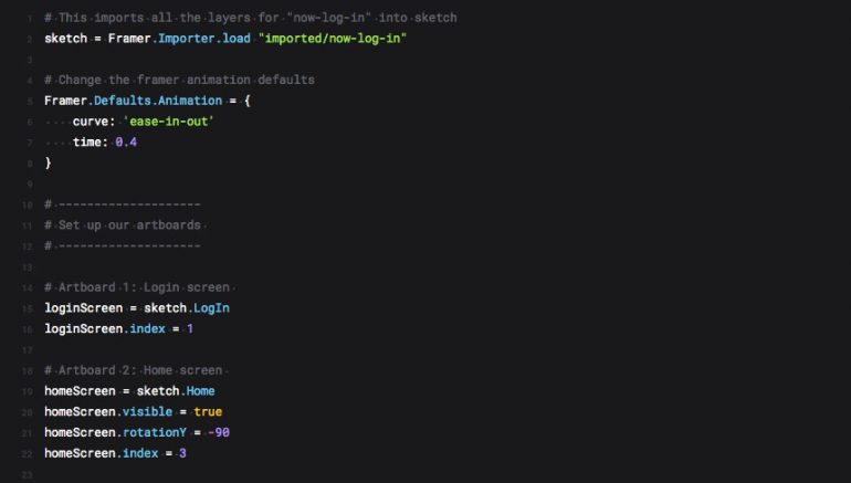
The beauty of Framer Studio is that you can quickly tweak your animation settings using the live preview feature.
The end result
After a few hours of playing around (and getting a little side tracked) I ended up with a prototype that did the following:
- Fades in a greyscale background followed by the logo
- Fades in the login form
- Transitions the greyscale background to colour
- When the login button is pressed a loading icon appears and spins
- The login screen then flips to reveal the home screen
- Pressing the burger menu open button shows the off-canvas menu
- Pressing the burger menu close button hides the off-canvas menu
Preview Link
Check out this link in Chrome, Safari or on your iOS device to see the prototype in action.
Video simulation
I also captured the animation on device using QuickTime on my mac. Check out the video below.
Final thoughts
The code I wrote for the prototype is pretty basic, repetitive and has plenty of redundancy. Once my coffee script gets better I'll start using conditions, loops, functions and tighten things up a bit.
I also didn't set up any thresholds for the interactions, use any spring curves or fine tune the transitions. I also wouldn't hold up the example above as a killer example of interaction design or app usability. There is also an initial lag which affects the animation due to fact that all the Sketch assets are loading. Give your browser (a soft) refresh and it should look a bit slicker.
So will I use Framer Studio again in the future?
Yes for sure. I think Framer is particularly useful for prototyping those interactions that are beyond InVision and Marvel.
Framer definitely has it's place and I wouldn't recommend using it to prototype out a whole app, as your code will soon get pretty bloated. But for micro interactions and transitions between screens/views I think it is invaluable.
Source code
I've included a ZIP file with the Sketch and Framer source files if you want to see what I've done.
