- Client: Clydesdale Bank
- Agency: Karmarama
- Date: May 2014
- Duration: 1 month
- My Role: UX Designer
- Deliverables: User journeys, sitemap, sketches, prototype
To better understand their customer needs Clydesdale Bank conducted an extensive survey with their customers about their banking experience.
Karmarama was tasked with developing an integrated campaign to communicate the feedback from the survey.
I was contracted by Karmarama to lead the UX design on the project.
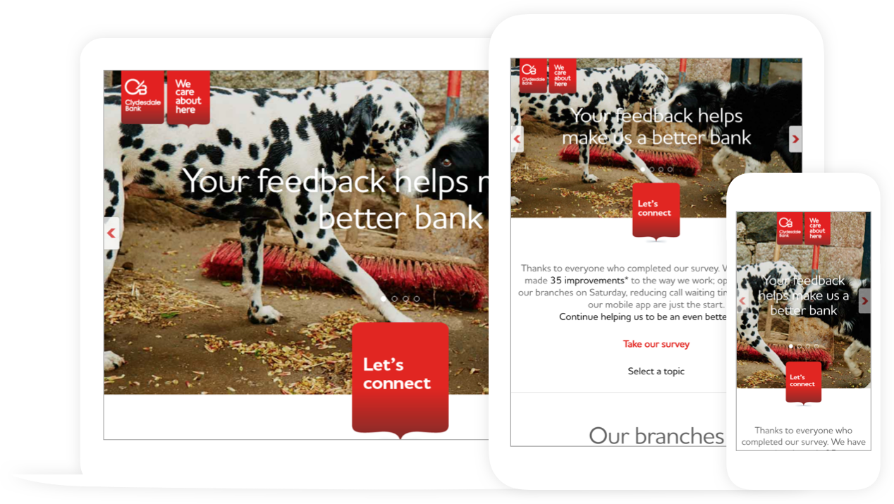

Image courtesy of William Iven
Process
I worked alongside the account, design and development teams at Karmarama to develop a responsive website experience that effectively showcased the campaign.
We adopted an iterative process that involved the development of an Axure prototype. Throughout the project we had regular calls with the client (based in Scotland and Yorkshire) and internal reviews for key deliverables to ensure the project met the tight deadlines.
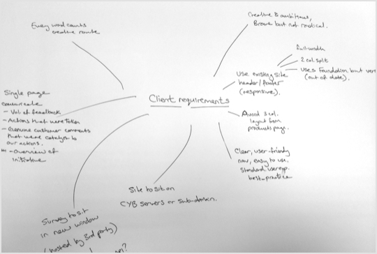
Requirements Gathering
Capturing key requirements of the user experience during the discovery stage of the project helped us to define the scope of the website early on in the process.
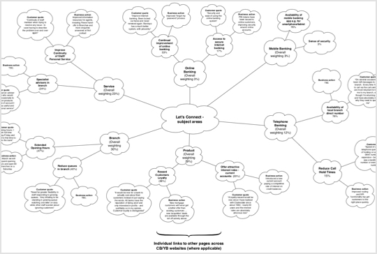
Content Mapping
Mapping key content types and groups enabled us to develop a clear content structure and hierarchy that would feed into both the sitemap and wireframes as well as define some of the project's technical requirements.
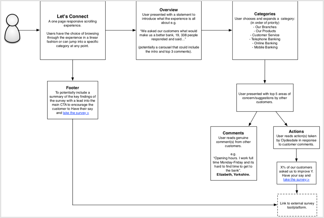
User Journeys
Developing key user journeys through the experience helped us understand how to best design each screen and the wider flow through the website.
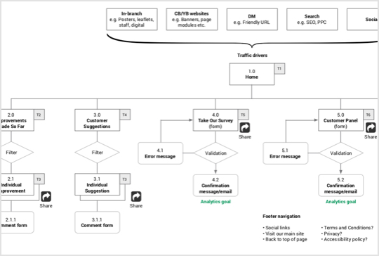
Sitemap
The sitemap enabled us to capture and agree upon the structure of the website.
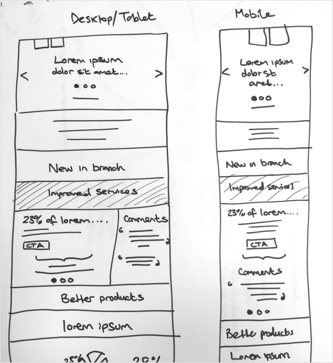
Initial Sketches
Example sketches showing the responsive layout for the website.
Axure Prototype
Video walkthrough of the Axure prototype. It was used to demonstrate key functionality to the client before design and build.
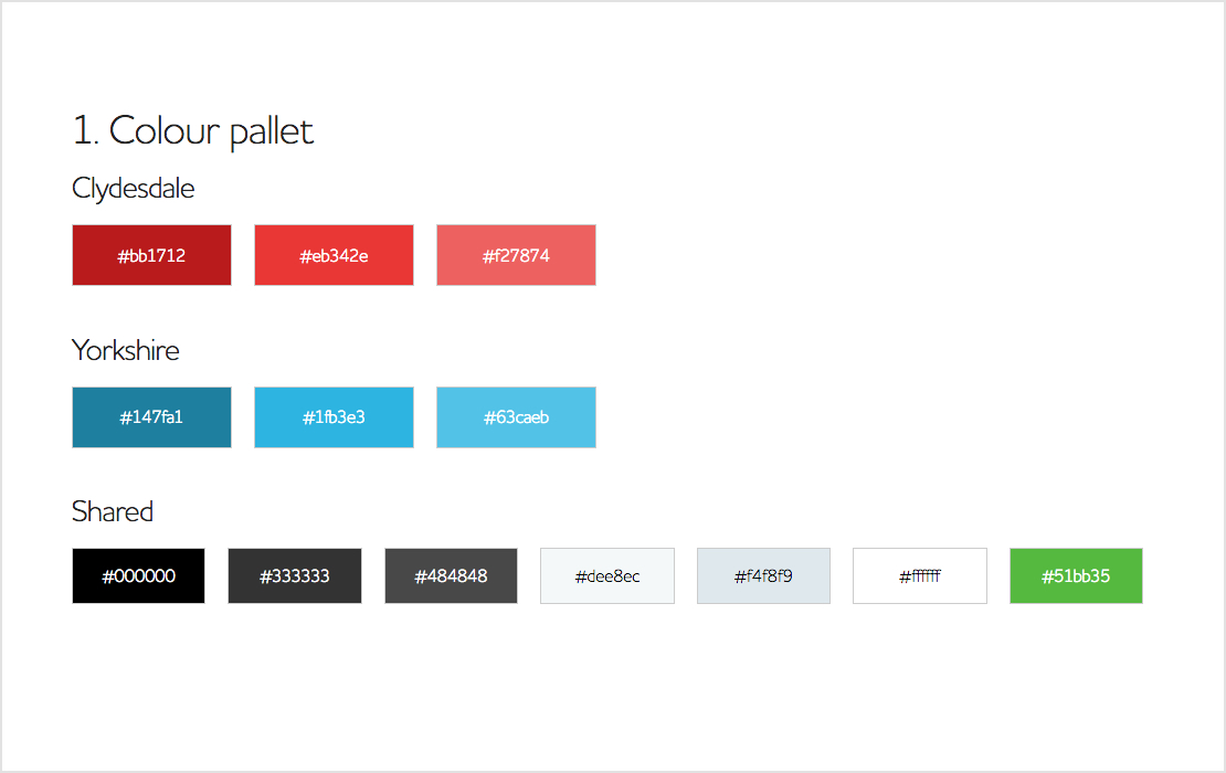
HTML Style Guide
I produced a basic HTML style guide to accompany the Axure prototype. This was used to communicate basic colours and typographic styles as well as interaction states for key components such as buttons.
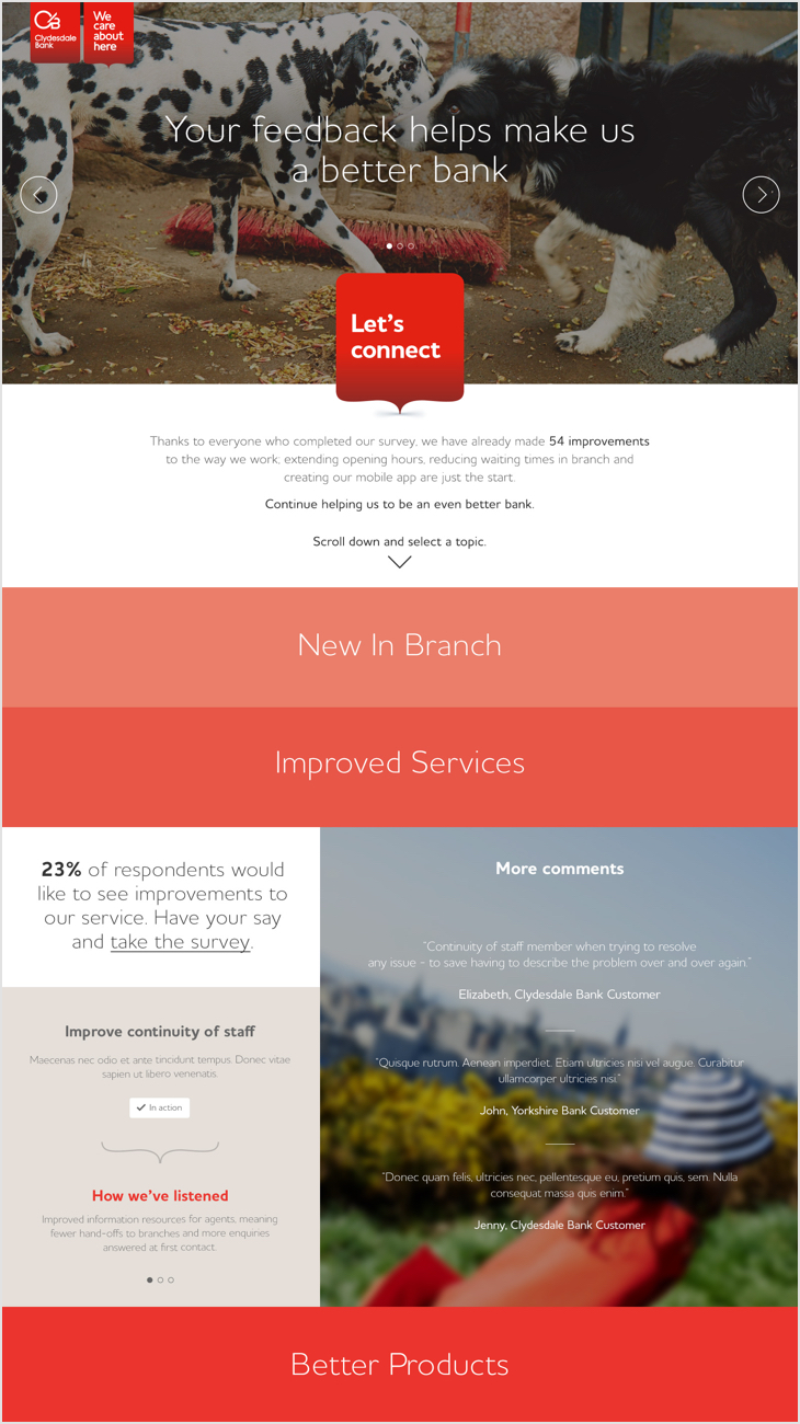
UI Design
Sample designs showing how the homepage looked on both desktop and mobile devices. The UI was designed by (then) Karmarama designer Ted Sterchi.

Testimonial

Anna Agapiou
DIGITAL DESIGN DIRECTOR
"Ben is a fantastic collaborator and creative thinker. He not only has the experience knowledge and skill set to deliver concise deliverables but he's a pleasure to work with and brings a wealth of technical expertise to the table. This in turn makes it super efficient to arrive at thoughtful solutions. I enjoyed working with ben very much and will always welcome him to my team."