A brief look at the design tools I use on a daily basis (and the wish list I'd like to test out in the near future).
It's a great time to be in UX and digital product design. There are so many tools now available, many of which are free. But how do you decide which are worth dedicating your precious time to learn?
Comparing Design Tools
One way to compare tools is to use sites such as UX Tools and Stack Share. They provide handy guides where you can decide what to use/try out based on cost, feature-set etc.
But what I find most valuable is reading about how others collaborate and the tools they use as part of their own process.
To that end, I decided I would take the time to share the tools that I use as part of my UX design process. Firstly to help others going through the same predicament. And secondly for any potential companies/clients who want to evaluate whether I'm a good fit for their design team/process.
Caveats
A couple of caveats before I start:
- Every project is different and therefore the tools you use will vary
- The tools and process below work well for me, but you might be slightly different. Use what works best for you.
- Although some companies are trying hard, there is currently no 'holy grail' UX design tool that does all things for all men (and women), so you will need to have more than one tool in your set-up
OK, enough caveats, let's get on with the list.
1. Analytics & Insights
If you are working on a redesign or iteration of an existing product or service, then gaining access to the current analytics accounts is essential.
Google Analytics
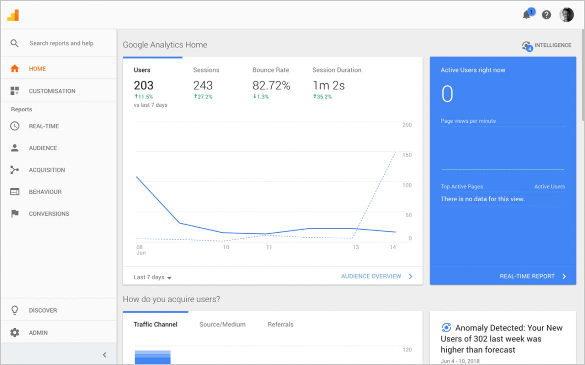
I use Google Analytics to gain insights into the macro-level site/product usage e.g. where people are coming from, what they are doing once they are on the site/product and where potential pain points exist.
Hotjar
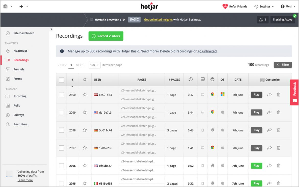
I use Hotjar (referral link) in conjunction with a few clients to gain a more in-depth understanding of how users interact/engage.
The recordings and heat map features are really helpful when trying to gauge where issues are occurring on a specific screen or user journey.
Google Search Console
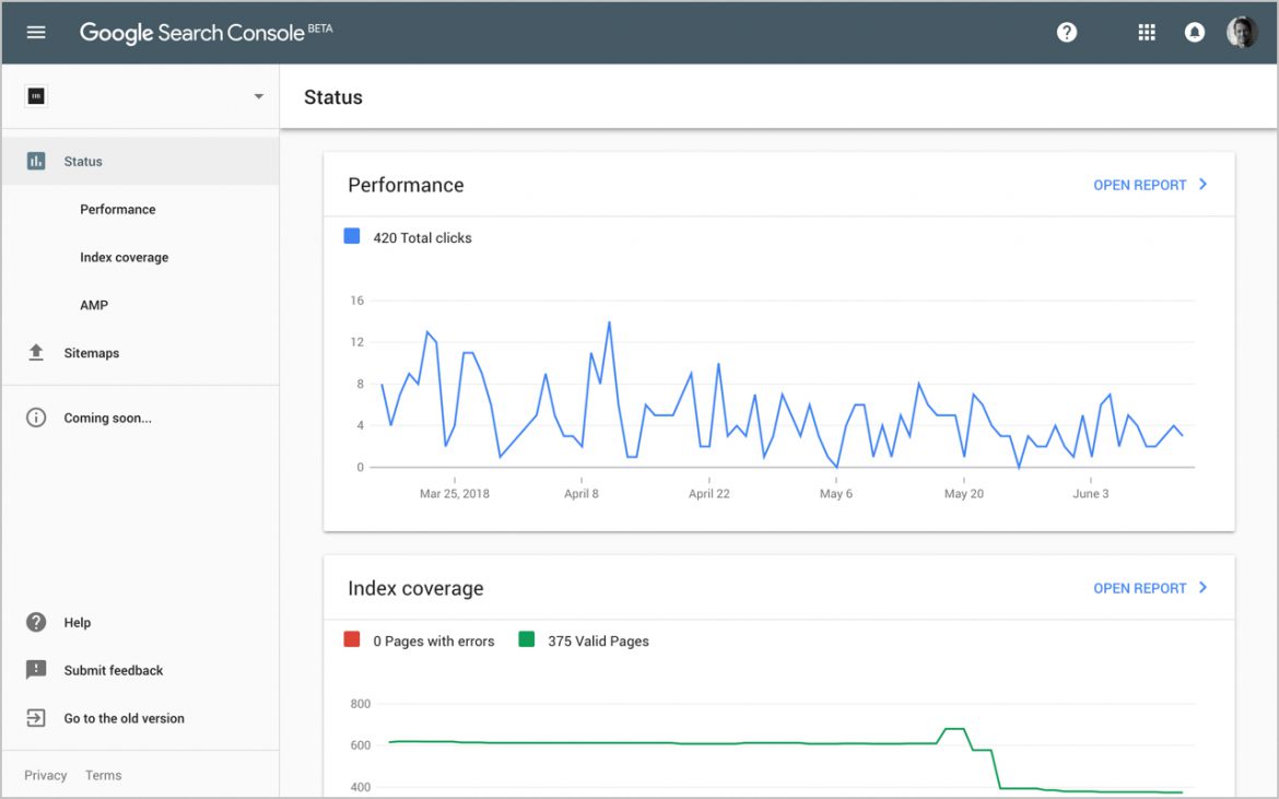
I use Search Console once a site/product has been launched to monitor SEO-related issues such as sitemap indexing, management of 404s and keyword ranking.
Google Optimize
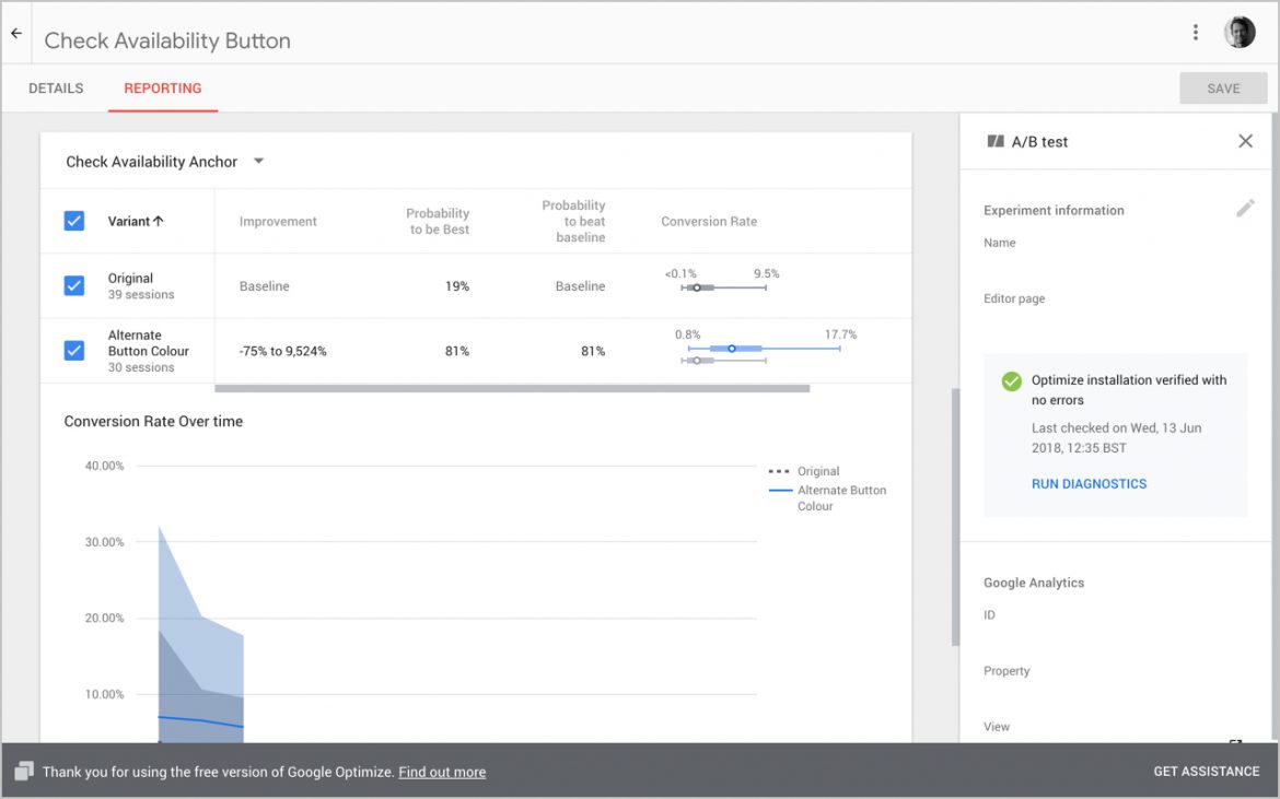
I use Google Optimise to quickly create experiments to statistically quantify which variants of designs will deliver the best user experience for customers. Supplementing UX best practice with data-driven design ensures the design process is more robust and less subjective.
2. Analogue Tools
For requirements gathering, user flows and ideation I try to keep my process analogue: pens, pencils, Post-It Notes, A3 sketch pads and the occasional whiteboard.
This helps get the ideas out of my head without getting caught-up in pixel polishing associated with graphics applications.
3. Planning, Requirements & Note Taking
Google Docs, Sheets and Evernote
Depending on the team/client I am collaborating with I will use a combination of Google Sheets, Google Docs and Evernote (referral link) to capture requirements and flesh-out use cases and journeys.
Omniplan
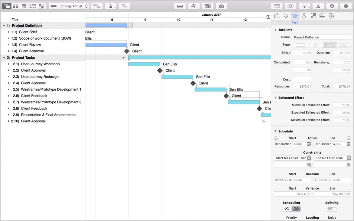
If I am responsible for putting a Scope of Work together, I find that creating a project plan (GANT) in OmniPlan is essential for estimating timelines, dependencies and costs.
4. Collaboration
Trello
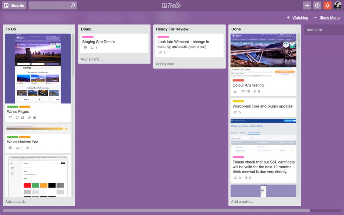
To provide visibility of project tasks to clients, I tend to use Trello (referral link). I usually create three simple boards (To Do, Doing, Done) and list and prioritise tasks. We then use this as a place to share feedback and approval.
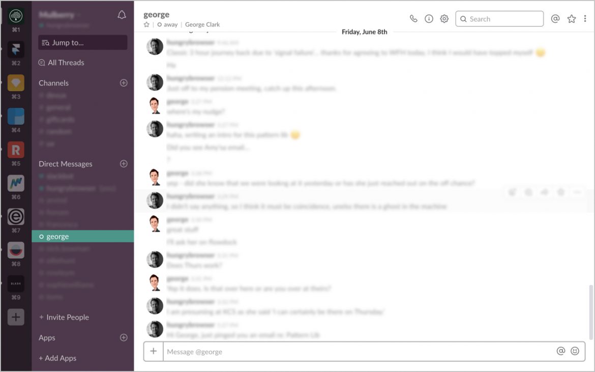
Slack
A lot of design teams have bee mad about Slack for quite some time, I'm kind of indifferent about it, but as I use it so much across the different teams I work with, I thought I would list it here.
Dropbox & Drive
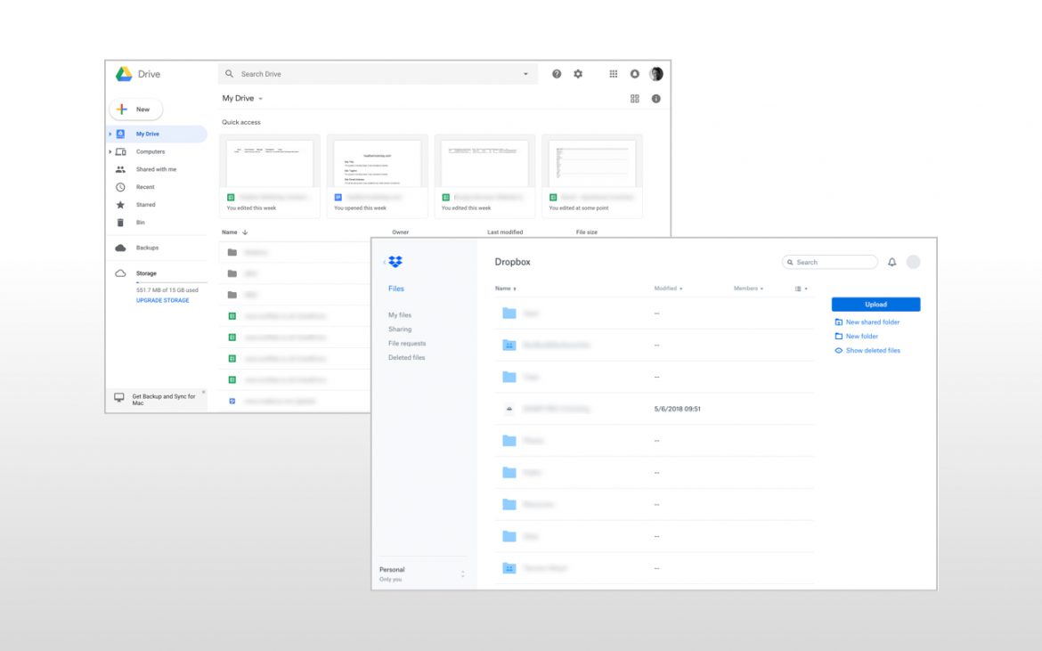
I use Dropbox (referral link) as my primary file-sharing tool and run all my active projects in my Dropbox folder for four reasons:
- So I have a central location for all project assets
- So I can share work with clients and get feedback
- So I can share work with other members of the project team
- As I work across multiple computers (MacBook Pro & iMac) and need to always be working on the latest version of files
I do use Google Drive (or Backup and Sync on the Mac), but just tend to find Dropbox works a bit smoother for me (plus I have been using it for longer).
5. Wireframes & UI Design
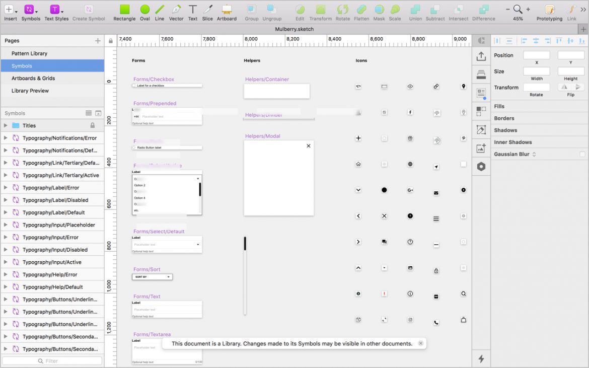
Over the years I've used many tools to produce wireframes; OmniGraffle, Fireworks, Axure, Visio and HTML. But for about the past three years or so, I have moved my entire wireframe process (and occasional UI design) to Sketch.
Sketch
A focused toolset for modern-day product design. Layer Styles, Text Styles, Symbols, Libraries and a sea of 3rd party plugins. What is not to like?
IconJar
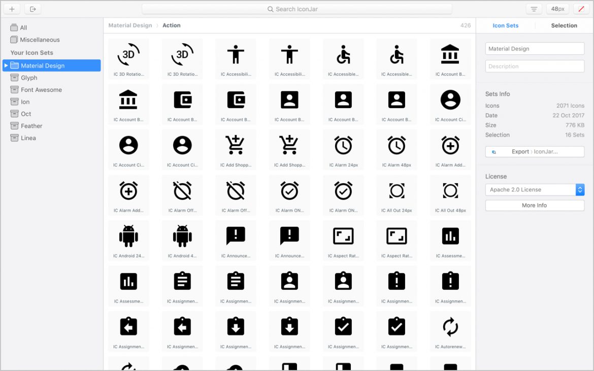
I use IconJar to manage different icon sets and easily integrate them into my Sketch documents for both wireframing and UI design.
6. Prototyping
The rise in popularity (and importance) of prototyping over recent years has been (almost) exponential. We now live in a world where there's (nearly) a new tool appearing on the market daily.
I love trying out different prototyping tools, but I have settled on a few (outlined below) that enable me to work accurately and at speed as part of my daily workflow.
Sketch
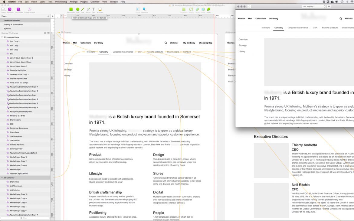
As of version 49, you can create basic clickable prototypes inside Sketch. This is the kind of work I used to do in Flinto. But now I can share an early prototype with clients/team from within Sketch. This helps speed up my workflow in creating iterations, prior to moving to Flinto/Framer or Principle for higher fidelity work.
Flinto
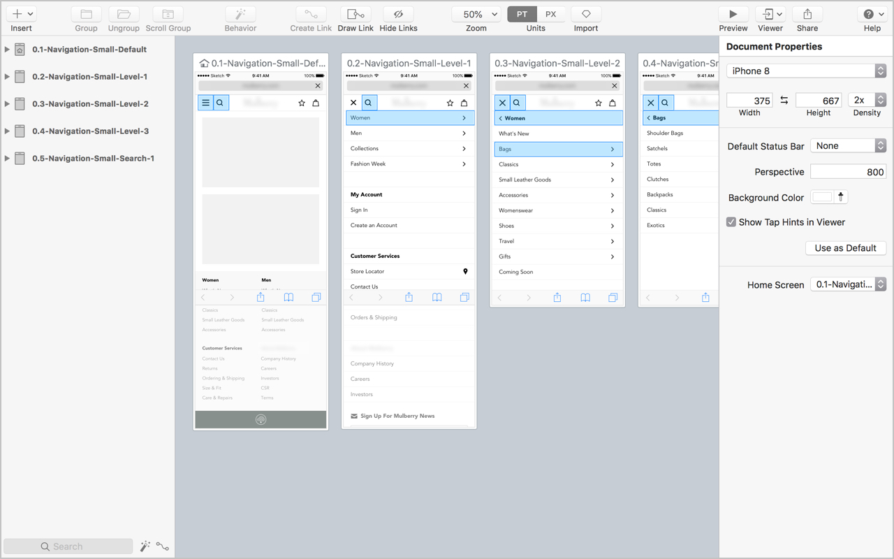
Flinto is my first choice when putting together medium to hi-fidelity clickable prototypes.
Depending on the purpose and timeframe for the prototype, I start off with simple screen-to-screen fading transitions and then increase the fidelity over time.
Flinto's custom Transition and Behaviours functionality enable you to create some pretty involved interactions.
The level of polish and fidelity I've achieved with Flinto has won me repeat work with numerous clients.
Principle
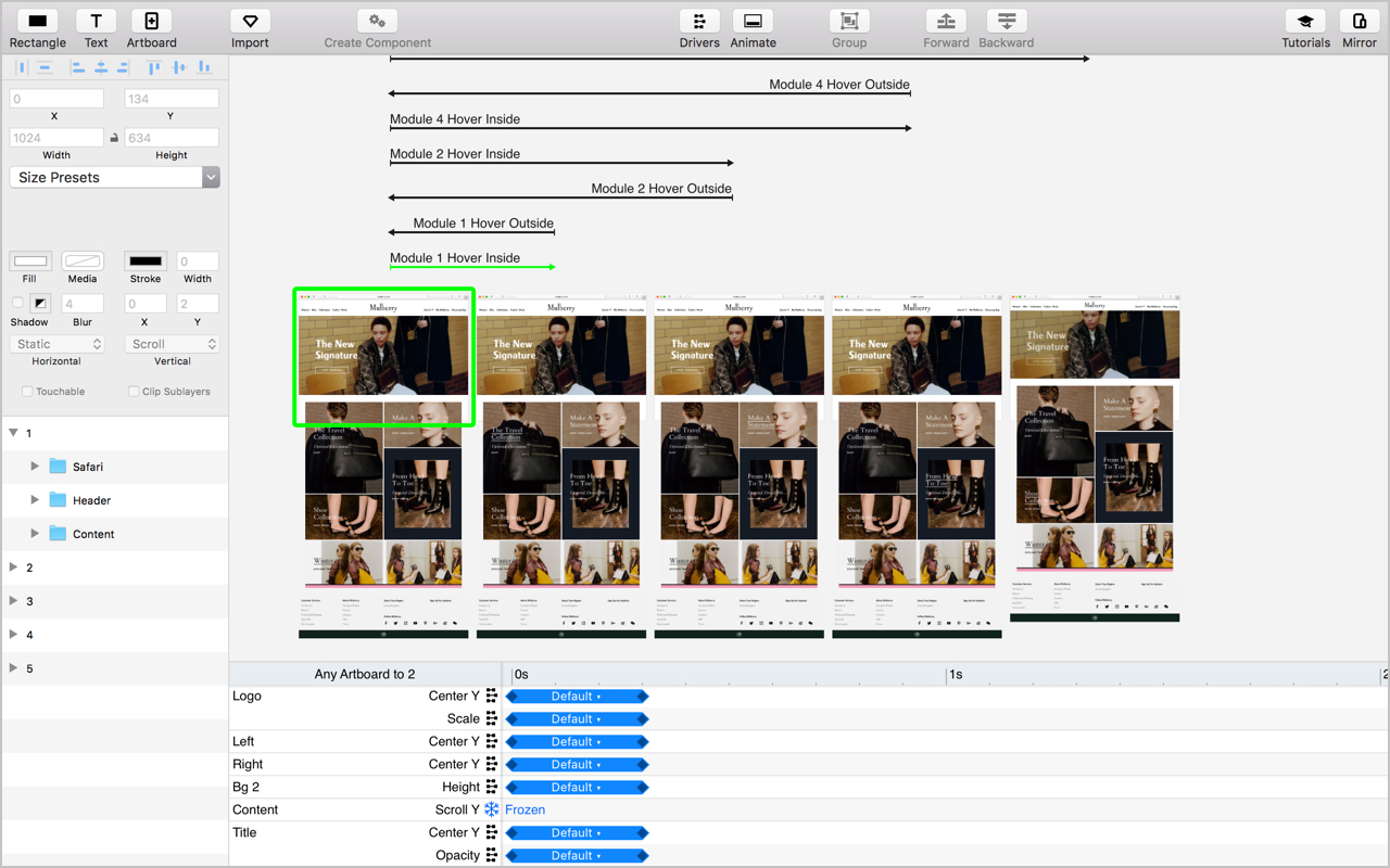
Of late, I've found I've not used Principle as much as I used to (due to the Behaviour Designer in Flinto) but I still want to include it here as I've used it to produce some effective hi-fidelity prototypes.
InVision
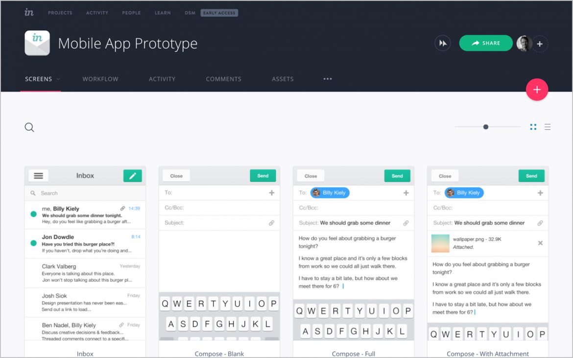
I tend to only use (the web version) of InVision when I am collaborating with a design team that already uses it as an integral part of their process. I find I get more polished results using Flinto, Principle or Framer.
Framer
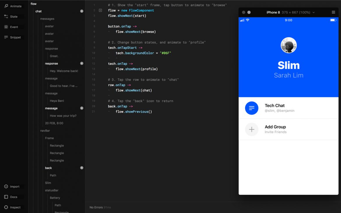
I've used Framer for specific prototypes in the past, and although I don't use it on a daily basis, I still keep it as part of my toolbox for the endless possibilities it offers through its code-based interface.
7. Handoff
Zeplin
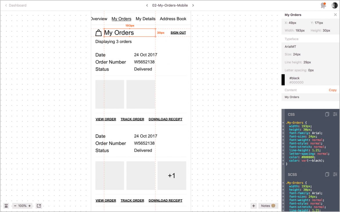
Currently, Zeplin is my go-to tool for assets collaboration and handoff. I introduced to the team at Mulberry and we now use it for designer and developer handoff as well as a collaboration tool to gain feedback from the wider team.
Screenflow
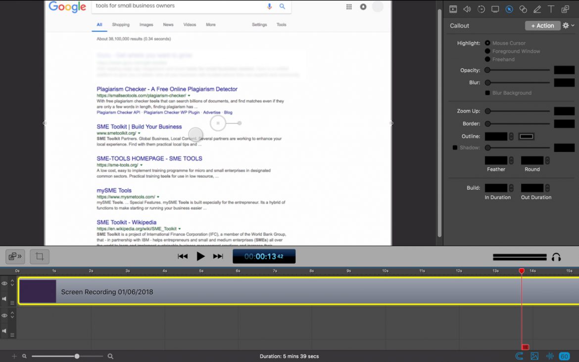
If a picture paints a thousand words, a video increases this by at least tenfold. I use ScreenFlow to video interactions and end-to-end prototype walk-throughs. It just makes it easier to communicate using video clips rather than spending time on annotating static assets.
8. Photo Editing
PhotoShop
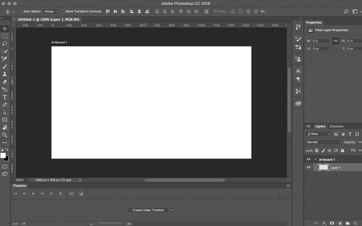
I haven't used PhotoShop for UI design for at least 5 years (maybe more), and I mainly use Lightroom for my photography. But there are still times when I need to create a comp or do something in a little more detail and that is when I break out the old Adobe workhorse.
9. Development
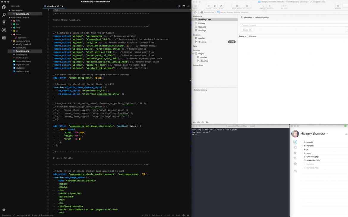
Although I am not a full time (bleeding edge) developer anymore, I still use the following tools from time to time when writing front and back end code.
10. Tools to Review/Limited Use
Like I said at the start of this post, new tools seem to be emerging daily. Here is a list of some of the tools I have my eye on and am looking forward to testing when the right project (or spare time) comes along. Look out for a follow-up post sometime soon.
- Atomic
- InVision Studio
- InVision DSM
- Lingo
- Google Material Design Gallery
- Overflow
- Maze
- Plant
- Abstrakt
- Trunk
- Kactus
I'd love to know what you think of my tools and process. If you have any tips or feedback, then feel free to leave a comment below.
