12 tips to consider when designing an online gym class booking experience.
The Start of My Journey
Recently my local Nuffield Health gym has moved to an online gym class booking experience. In search of recovery from a recent injury, I thought I would check out some of the pilates/yoga classes.
I started my journey as most do, in Google, searching for the website URL for my gym. Once located, I jumped onto the website, found my local gym and viewed the available classes.
TL;DR
If you just want to read the 12 tips, then follow this anchor to the bottom of the article.
Easy Account Registration
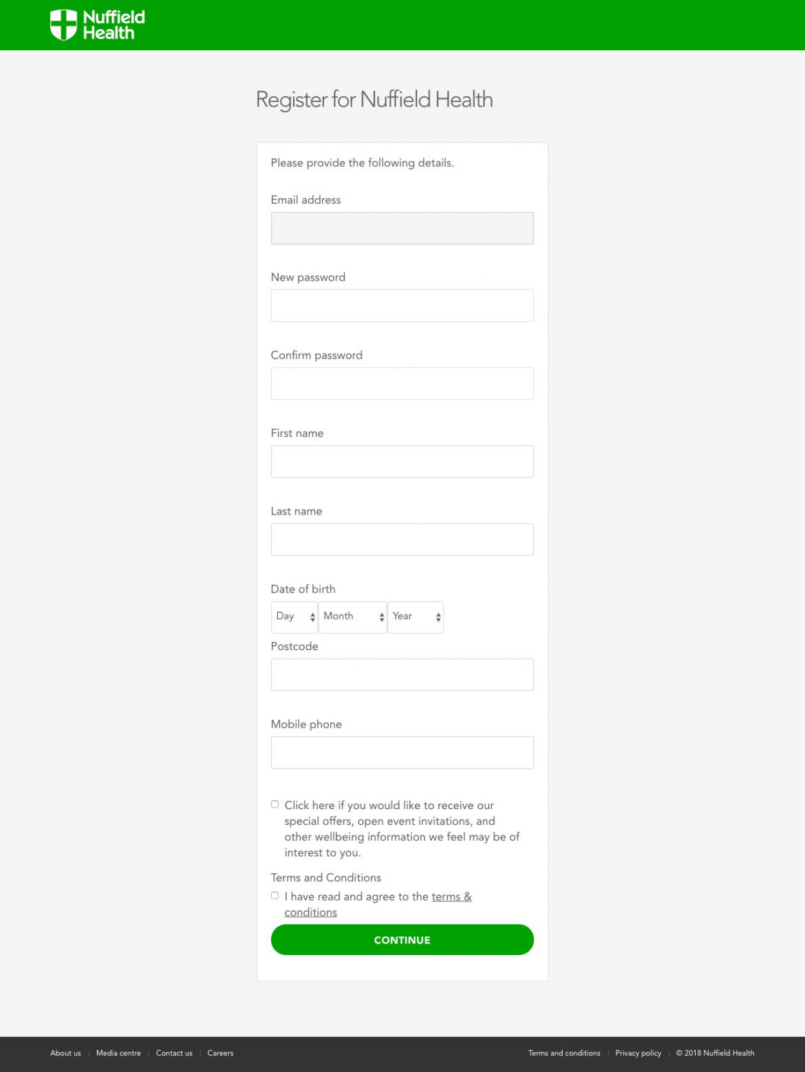
Before I could book a class, I had to create an online account. The registration process was reasonably simple:
- Enter email
- Receive an email to verify its actually me
- Complete simple registration
- Receive confirmation
- Log In
Joining the Dots
However, at no point during the registration was I prompted for my membership number. Strange I thought. How is the system going to know I am a member of my local gym?
Maybe it's clever enough to match the email they have on file at the club with the one I just registered?
Maybe they use some sort of geolocation to match me to the closest gym?
Maybe they tracked that I triggered the sign up from my local gym landing page?
Maybe none of the above.
Initial Log In
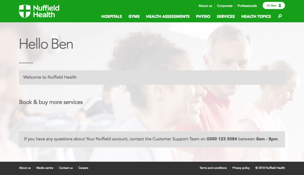
Evidently not. Upon the first login, I was greeted with a blank page. No club details, no option to book classes, no option to change my account details (accept my password).
Mmm this isn’t very useful I thought, and all very GDPR non-compliant (more on this later).
So I had a further dig around to see if there was a screen for me to enter a local club. Unfortunately not.
Nothing in the FAQs either. This was all becoming a little tiresome.
Here's One A Made Earlier
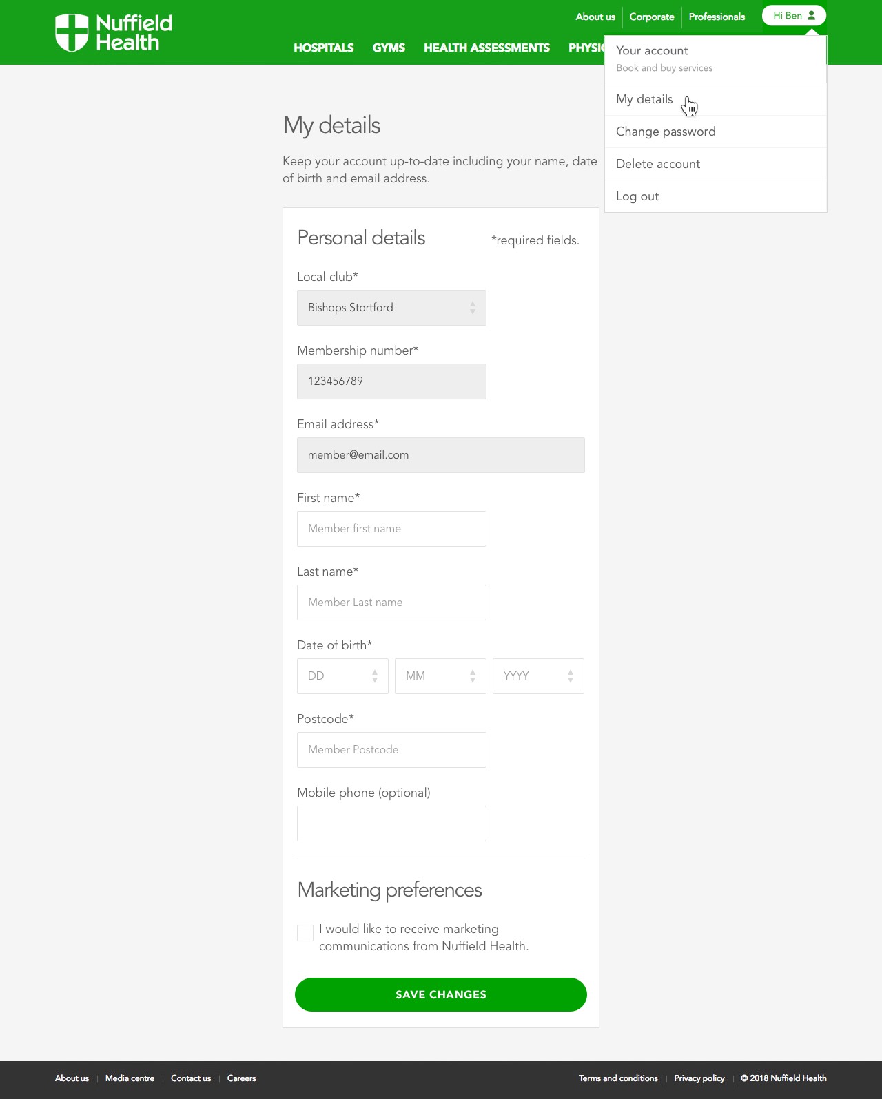
This is what the 'My details' screen could look like if Nuffield Health had got their act together. One can only live in hope...
Twitter To The Rescue?
In a mild fit of rage, I took to Twitter and contacted Nuffield Health. I asked them what I/they could do to rectify the situation.
A very polite and helpful social media executive said that if I emailed my name, email and club details, they’d pass it onto IT who might be able to help.
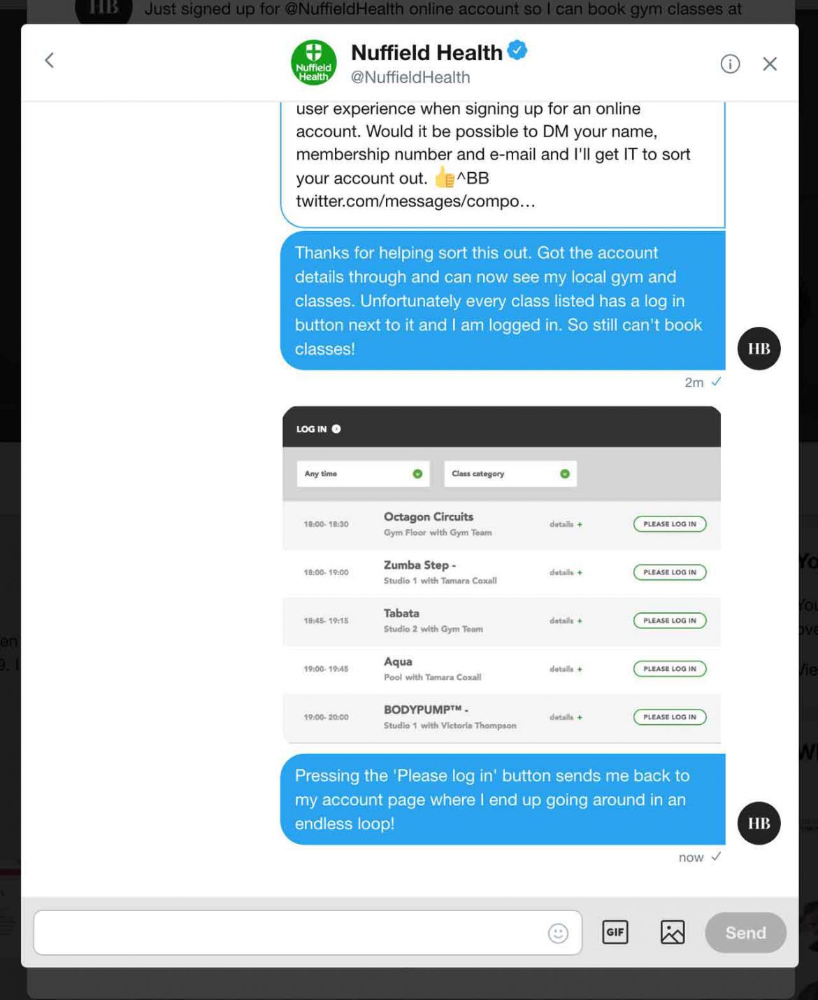
I passed on said details and continued with my day. A few hours later I received a DM, explaining that I should now see my local club if I logged in again.
Optimism Will Only Take You So Far...
Optimistically I returned to the site, logged in again and hey presto as if by magic, my local club appeared.
I had another cursory glance around my account, still a distinct lack of ability to edit any details, but at least I had a link to go and check out the classes. Progress!
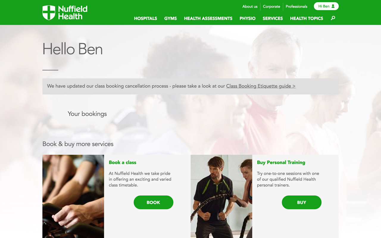
Back to the task at hand, I located the ‘Book and buy services’ section and hit that big green 'Book' button and was taken to a list of classes for my local club.
Nearly there I thought, I’m only steps away from my first pilates class and on the road to recovery.
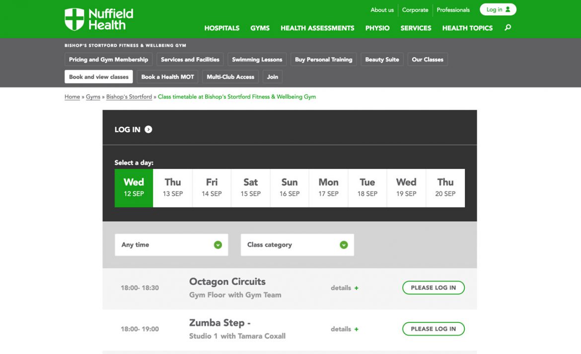
I scanned the list of classes, found the one and I wanted and was then confronted only with buttons labelled ‘Please Login’.
Booking Experience Endless Loop
Mmm, strange, I thought I was logged in. A quick glance up to the page header, and sure enough, first name, last name and a little avatar. I’m definitely logged in.
So I hit the ‘Please Login’ button and then got sent back to the My Account dashboard, essentially getting caught in an endless a loop.
I tried this a few more times, but the same thing happened.
Emptied cache and killed all my lovely cookies. No joy.
Tried a different web browser. No joy.
Tried a different device. No joy.
Twitter Revisited
Back to Twitter DM. The polite social media executive suggested some tips (that I’d already been through - see above).
I explained that I’d been through all this and life was too short for this kind of stress.
The social media executive sent another support ticket back to IT.
Next day, the same thing.

Maybe My Local Club Can Help?
I decided to drop into my local club to see if they can help. They said that due to the popularity of online bookings, all the pilates classes were fully booked. How, I thought? The system doesn't work. They said they would contact IT to investigate further. That's the last I heard from them.
Fast Forward
Fast forward one month to today, and still the same thing. The system is obviously STILL not working. Probably time to just give up and just delete my account (oh yes, I just remembered, I can't delete my account).
GDPR
So now I have an online account that I can’t do anything with: I can’t book classes, I can’t access my personal data and I can’t delete it. I can change my password though, how helpful!

This neatly brings me onto my final point. GDPR and my personal data.
Yawn I hear you say. Well, yes (a little bit), but I think it is important to mention. Although I am sure Nuffield Health have no malintent, their system simply doesn’t work.
The New Rules In Brief
On the 25th May 2018, GDPR came into force, this essentially means any organisation within the EU who is collecting your personal data now has new obligations.
Right of Access
You now have the right to request a copy of the personal data that a company has collected.
Right to Rectification
If a company that collected personal data, you now have the right to have inaccurate personal data rectified.
Right to Erasure
You now have the right to have your data erased e.g. if you opted into a newsletter or created an account that you no longer wish to have/receive.
Yeah, And?
So what does this all mean in the context of my story?
Well, it means that if Nuffield Health were following best practice they would have:
- Built an online booking experience that actually worked
- Given me the ability to correct my personal details online
- Given me the ability to delete my account and personal data online
I don't think that is too much to ask for?
The GDPR Caveat
I should note that Nuffield Health isn’t obliged by GDPR to provide me with online access to my data. I can access it via writing a letter or phoning them.
But really, this is 2018, write a letter and wait up to 30 days for a response? Who does that!?
The Saga Continues
And so the saga continues, as yet there isn't a happy ending to my experience. Nuffield Health still hasn't fixed whatever bug it is preventing me (and others I presume) from booking classes online. I still haven't been to a single yoga or pilates class and I still am suffering from sciatica!
12 Booking Experience & GDPR Tips
So to finish on a positive, here are 12 tips to consider when designing any kind of GDPR-compliant, booking experience.
- Capture & prioritise key business and user requirements
- Map out key user journeys (and edge cases)
- Design your experience around the key needs of your users
- Set user expectations prior to signing up
- Increase task completion by asking for minimal possible data
- Provide users with online access to manage their data
- Ensure users can delete their account online
- Make it clear how users can contact your data officer
- Ensure your IT systems are fully integrated prior to launch
- Thoroughly test prior to launch
- Ensure you and your staff understand GDPR basics
- Realise that a poor online experience reflects badly on your brand
Bonus Tip: Realise that people like me will write articles about your poor experience if you don't fix it.
