Since January 2014 I've been freelancing as the sole UX Designer/Developer at the advertising agency, Karmarama in London. During this time I've worked across a variety of brands and briefs including UK-based telecoms giant, BT.
Part of the work for BT involves creating a large number of bespoke HTML landing pages that users navigate to, primarily from CTAs in marketing emails.
These pages often contain targeted messaging, driving users to some sort of product offering or deal on the main consumer website.
As the nature of device usage continues to change, more and more people are accessing their email on a mobile device. It is therefore imperative that you ensure that this is a good experience. This means not only creating responsive emails that are readable on mobile, but also the landing pages they drive users through to.
The legacy approach to UX on the BT account (and most other accounts) involved a traditional waterfall method of receiving a brief from a client, investigating UX design routes, creating static wireframes, getting them signed off and then moving them across to design and ultimately development, before finally launching.
We all (should) know the pitfalls of trying to use static wireframes to document a fluid experience (e.g. a responsive page); it takes longer to communicate your ideas, you miss the subtleties in the behaviour of content at the breakpoints and interactions are harder to design and perfect.
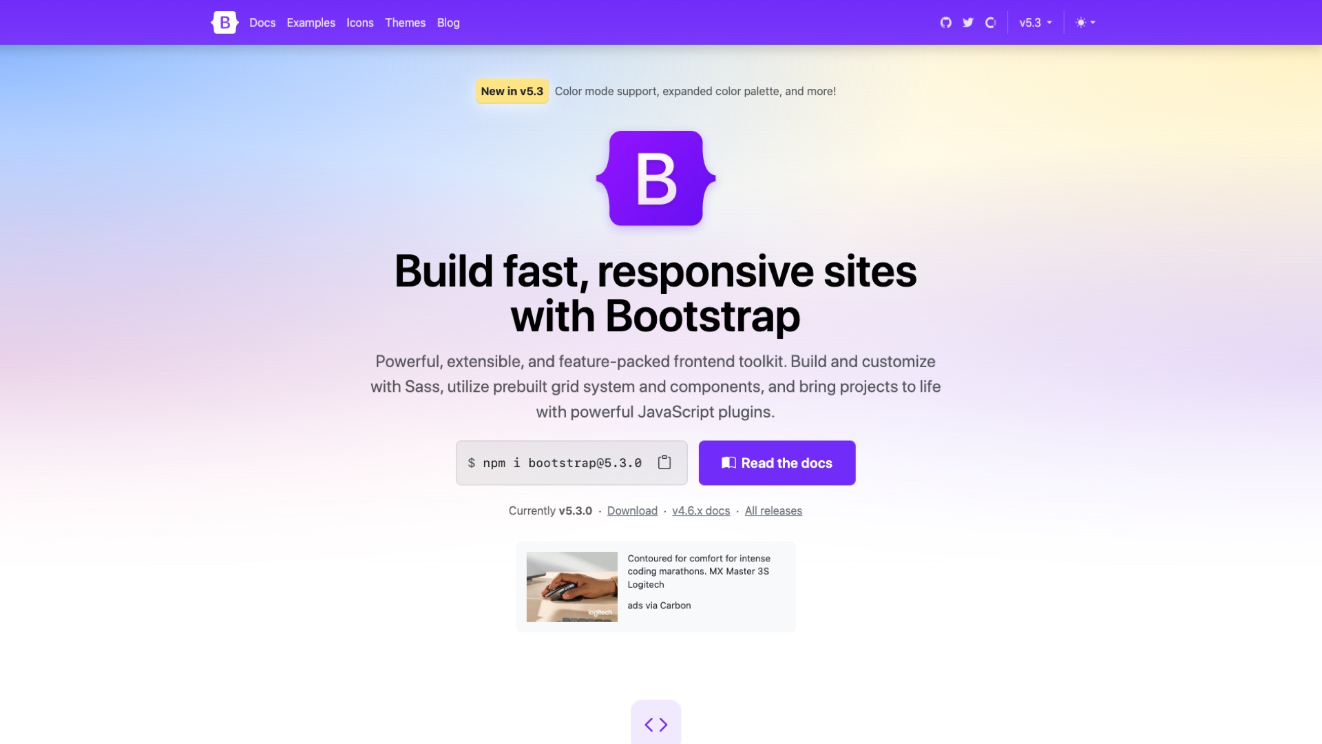
Shifting the emphasis to rapid HTML prototyping solves a lot of these issues. I use a variety of methods to produce HTML prototypes, depending on the needs of the project. For BT using Twitter Bootstrap (specifically an older version to support legacy versions of IE) was the best fit.
A new responsive workflow
The workflow for a typical responsive landing page now involves:
- Interrogating a brief from the client
- Sketching out ideas on paper and then discussing them with members of the design and development teams
- Downloading the latest version of our bespoke version of Bootstrap from our GIT repository
- Breaking out Sublime Text and creating a basic page structure
- Testing the behaviour and layout of the page structure at different breakpoints
- Refining any page components e.g. carousels, accordions etc.
- Integrating the HTML into our GIT repository and generating a staging link to preview with the client
- We may then go through a round or two of amends, but these are done straight in the code
- Once we’ve got sign-off, we then go into visual design
- Skipping ahead a few steps, once designs are signed off, the development team then gets a copy of my source code from GIT and then uses that as the building blocks for the production HTML.
By designing the UX in HTML I am able to create efficiencies which are then passed down to the development team. The fact that everything is in GIT also helps us manage our codebase more effectively.
I would like to further push the process by encouraging the designers to learn HTML/CSS, design in the browser and look into tools such as Sketch or Macaw, but I think we are a little way from that at the moment.
If you are working with a similar process, I would love to hear about it. Conversely if you need help defining a better UX workflow when designing responsive experiences, then get in touch as I would love to help.


