- Client: B.heard
- Date: Spring-Summer 2015
- Duration: 3 months
- Role: UX Design
- Deliverables: UX strategy, sitemap, personas, user journeys, prototyping
B.heard's listening services enable people to share what they really care about. The insights from the service help inform the decisions made by companies, governments and organisations.
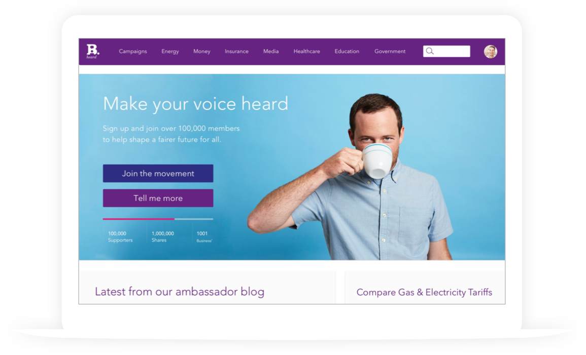
I was contracted to help the product team define and build a minimal viable product for the value comparison website and mobile app.
My deliverables helped the team demonstrate the core functionality and capability of the service to key stakeholders and investors.
Process
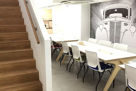
Based in The Garage (a tech-incubator workspace in Soho) the small, collaborative team (made up of the CEO, a software developer and UI Designer) developed a lean, iterative process which helped us to:
- Gather and refine business and user requirements
- Define the design problem
- Define the product
- Define the design principles
Requirements Gathering
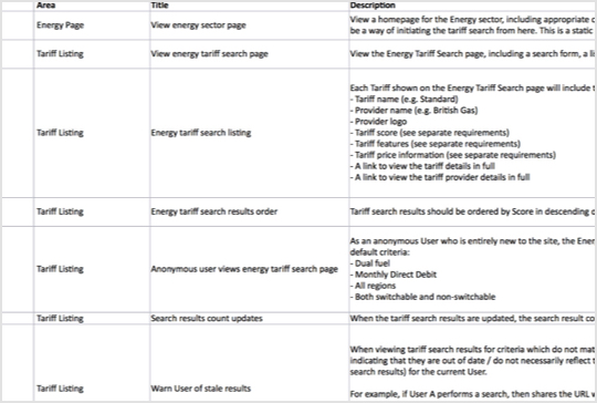
We explored key business and user requirements through several team workshops. These were then logged into a spreadsheet and prioritised in terms of importance to both the business and end-user.
This helped us define the shape and scope of what we were trying to design.
Sitemap
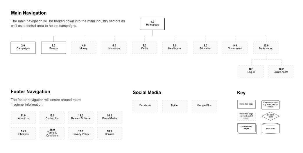
Working from the requirements document I developed a clear site architecture to ensure both the website and mobile app were easily navigable.
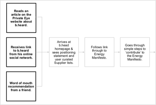
User Journeys
Key user journeys were explored and captured to help us focus our design efforts on the needs of the user.
UI Design
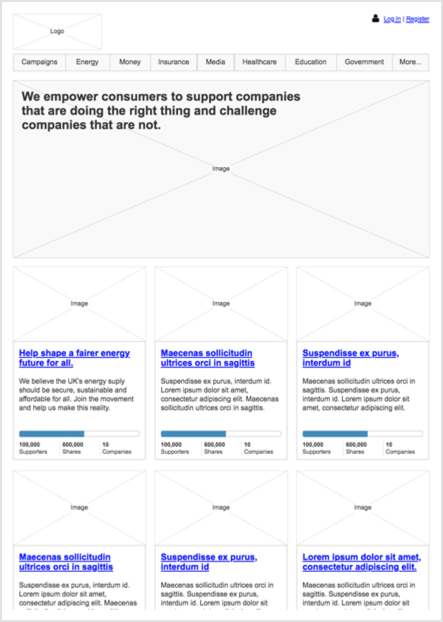
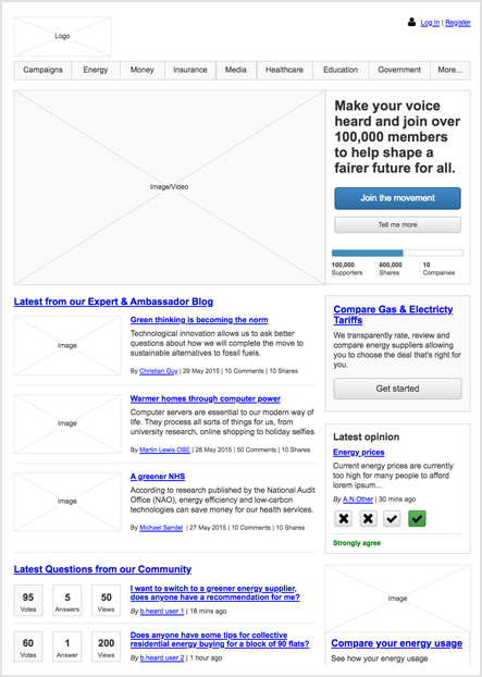
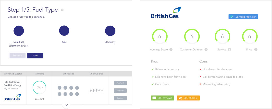
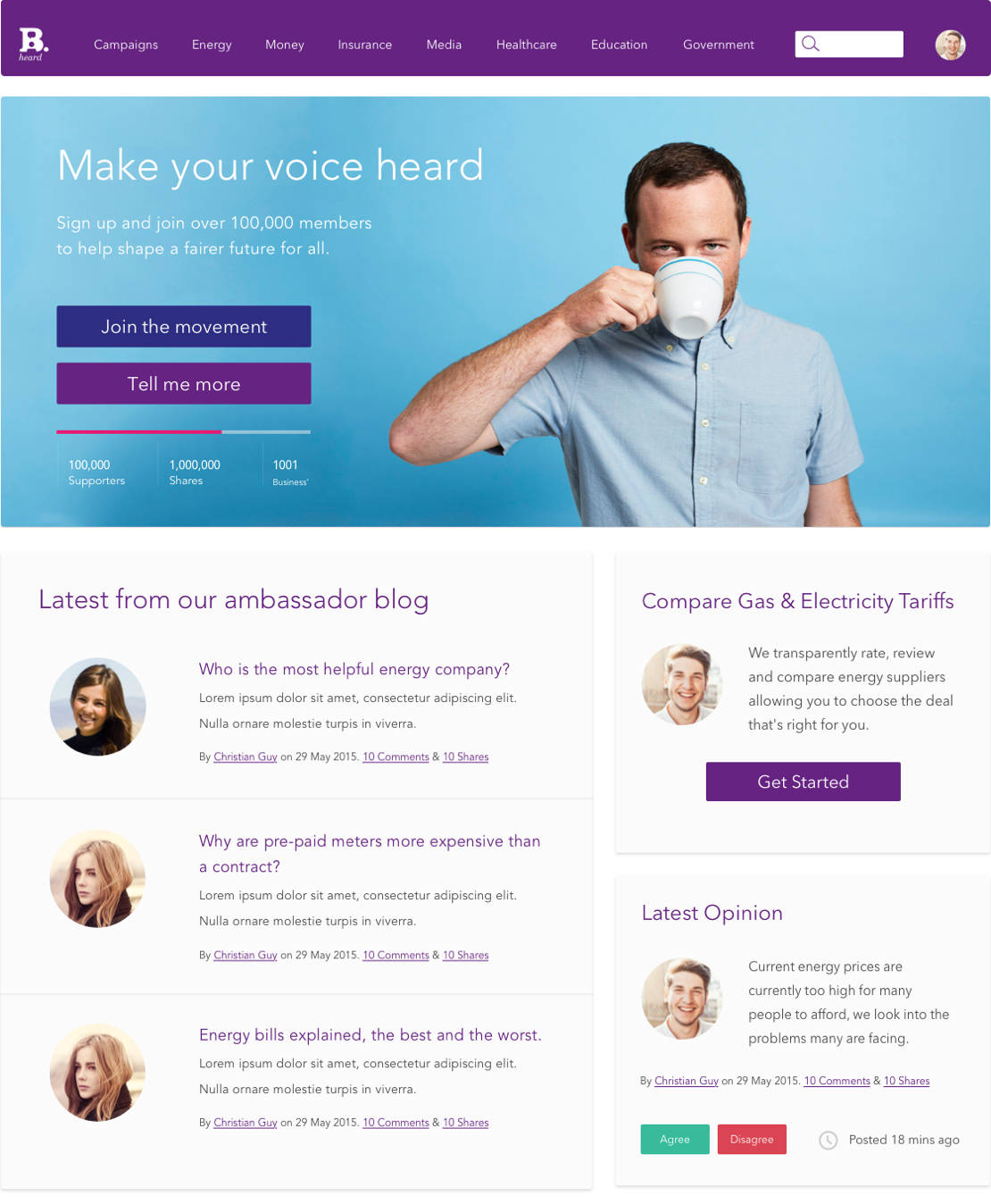
Based on the wireframes that I developed, UI Designer (Nick Clement) developed a set of components and key templates to communicate the potential look and feel of the experience.
Desktop Prototype Video
Below is a basic interactive prototype (built with Axure RP) to demonstrate two user journeys through the tariff search functionality.
Mobile App Experience
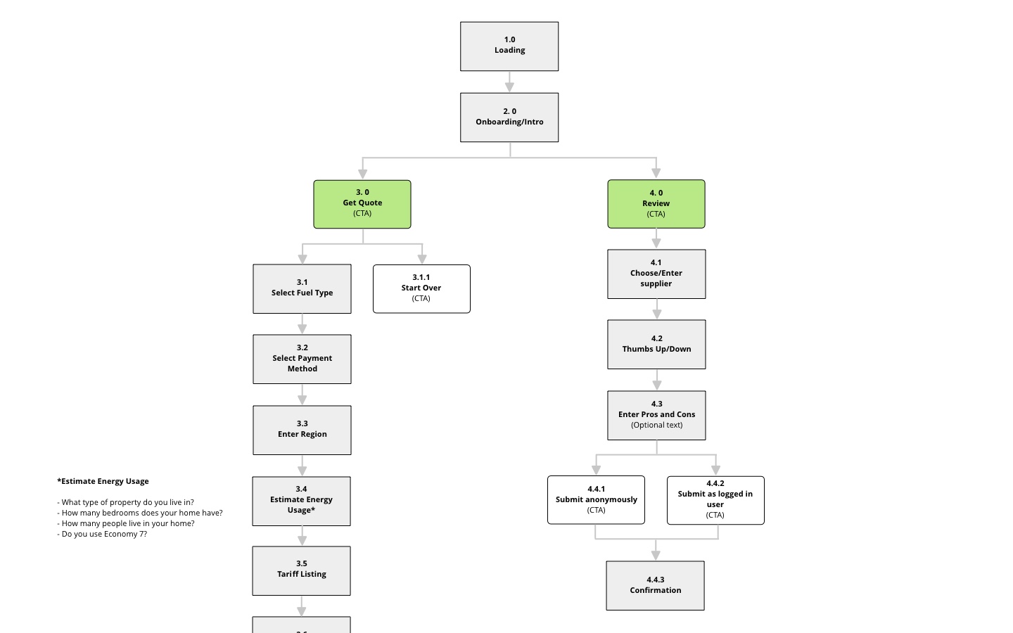
As part of the second phase of the project, a paired-back version of the web experience was developed as a native iOS app. I developed mobile-specific user flows to ensure the experience was as intuitive as possible for mobile users.
Mobile Wireframes
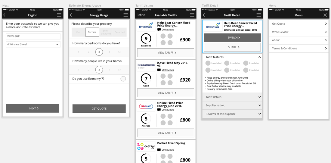
Key screens were developed in Sketch which would provide both basic structural blueprints for the mobile developers as well as the basis for the Flinto Prototype.
Mobile Prototype Video
Below is a video of the final native mobile prototype demonstrating the ‘get a quote’ functionality.
Testimonial

Oscar Vickerman
NON EXECUTIVE DIRECTOR
“Ben produced outstanding results whilst working as Lead UX Designer on our project. Great guy and worked well as part of the team.”
