- URL: travelsupermarket.com
- Client: Travel Supermarket
- Date: Summer 2015
- Duration: 2 weeks
- My Role: UX Designer
- Deliverables: Hi-fidelity wireframes, Framer prototype
In summer/autumn 2015 I freelanced as a Lead UX Designer at Travel Supermarket (a travel comparison website – part of the Money Supermarket Group).
The product team had an idea for an experimental feature for the website search that enabled users to search for holidays using a more engaging, map interface.
I worked closely with the product team to develop several prototypes to bring their ideas to life.
Sketch Library
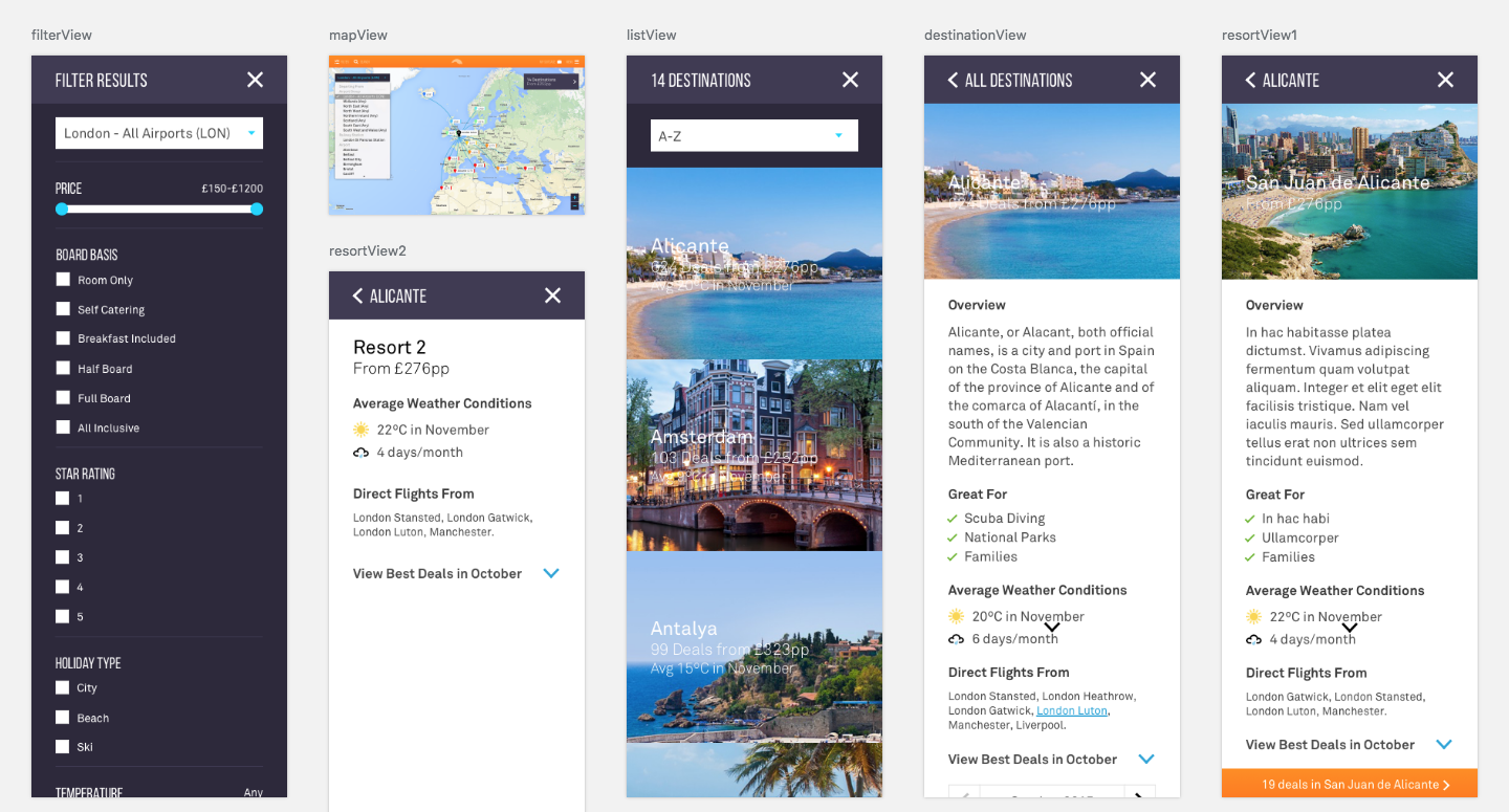
There wasn't a single source of truth for the current user interface (various PSD's, CSS files etc), so I developed a fresh library of reusable components in Sketch (shared styles, text styles and nested symbols).
In the first instance, I used these to mock-up hi-fidelity wireframes so that I could demonstrate the user journey. These were then later imported into Framer to produce two hi-fidelity prototypes.


Framer Studio
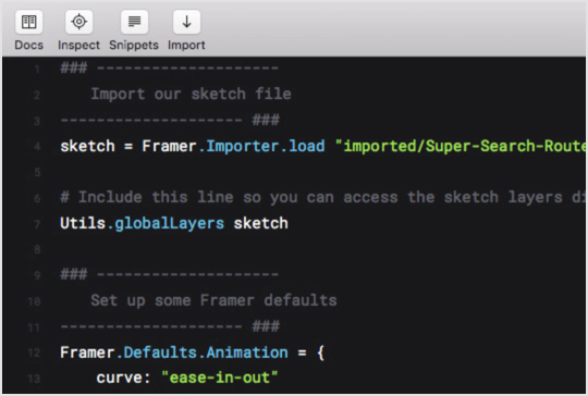
Working in Framer Studio enabled me to quickly develop an interactive prototype that demonstrated both the user flow and micro-interactions within the web app.
Final Prototype Videos
Below are two videos that demonstrate the prototype’s key interactions and transitions.