- URL: mckinlaykidd.com
- Client: Mckinlay Kidd
- Date: 2016
- Duration: 3 months
- My Role: UX/UI Design, Front & back-end development
- Deliverables: Wireframes, UI, HTML, CSS, JS, PHP
I worked with Mckinlay for over 10 years. During that time I developed three websites for them. In 2016 the directors wanted to consolidate their web presence into a unified platform.
This is the story of how I streamlined the user experience, improved the findability of content and updated the website ‘look and feel’.
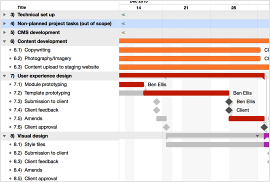
Project plan developed in OmniPlan
SOW & Project Plan
I worked with the client to refine their initial brief and produce a detailed scope of work.
I then created a detailed project plan to provide all project members with clear visibility of what tasks were included in the project and when feedback was required.
This allowed me to run the project in the most efficient way, reducing bottlenecks and avoid any potential downtime.
Collaboration
I adopted a lean, iterative process that was managed through the collaboration tool Trello.
Key tasks were taken from the project plan and input into Trello, colour-coded and assigned to members of the project team.
Trello was then used as a central point of communication and feedback on each task.
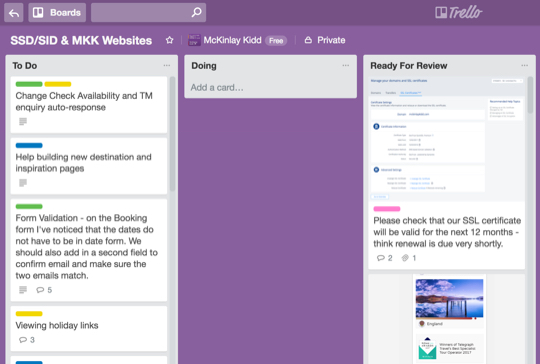
Organising key tasks using Trello
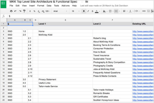
Using Google Sheets to capture the website architecture
Content-first
Before I designed anything, I needed to understand what content and functionality already existed and how it could be migrated from different sources and housed ‘under one roof’.
I audited the current client websites and logged all pages (along with specific meta info) into a Google Sheet.
This provided me with a clear outline of the breadth and depth of content and formed the basis for my approach to creating the new site architecture.
Interface Audit
I undertook an extensive interface audit to analyse the existing UI from a UX and visual design point of view.
I then developed a new content architecture (also in Google Sheets) that would accommodate existing content as well as new requirements.
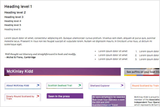
Collecting and categorising existing UI elements as part of the UI audit
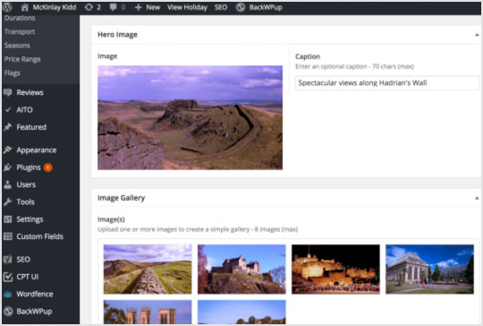
CMS Development
As the client had to migrate three site’s worth of content, I chose to develop the CMS prior to any further UX work. This gave the client a head-start on the content migration/creation process.
I was able to do this as I had clearly defined all functionality in the SOW and had an accurate content model from the UX content analysis.
The CMS was a heavily customised version of WordPress. In addition, the Advanced Custom Fields Pro plugin enabled me to develop a modular backend, based around reusable content modules rather than pages. Check out Brad Frost’s article on Atomic Design.
Sitemap
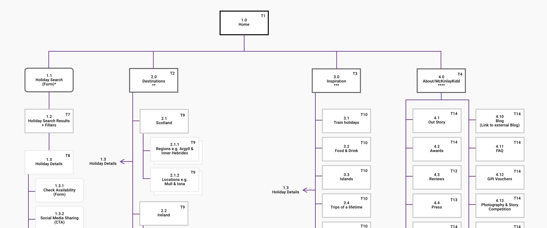
I then created a sitemap (in Sketch) that acted as a visual aid for the client to understand the site hierarchy and the relationships between content grouping and journeys through the site.
Wireframes
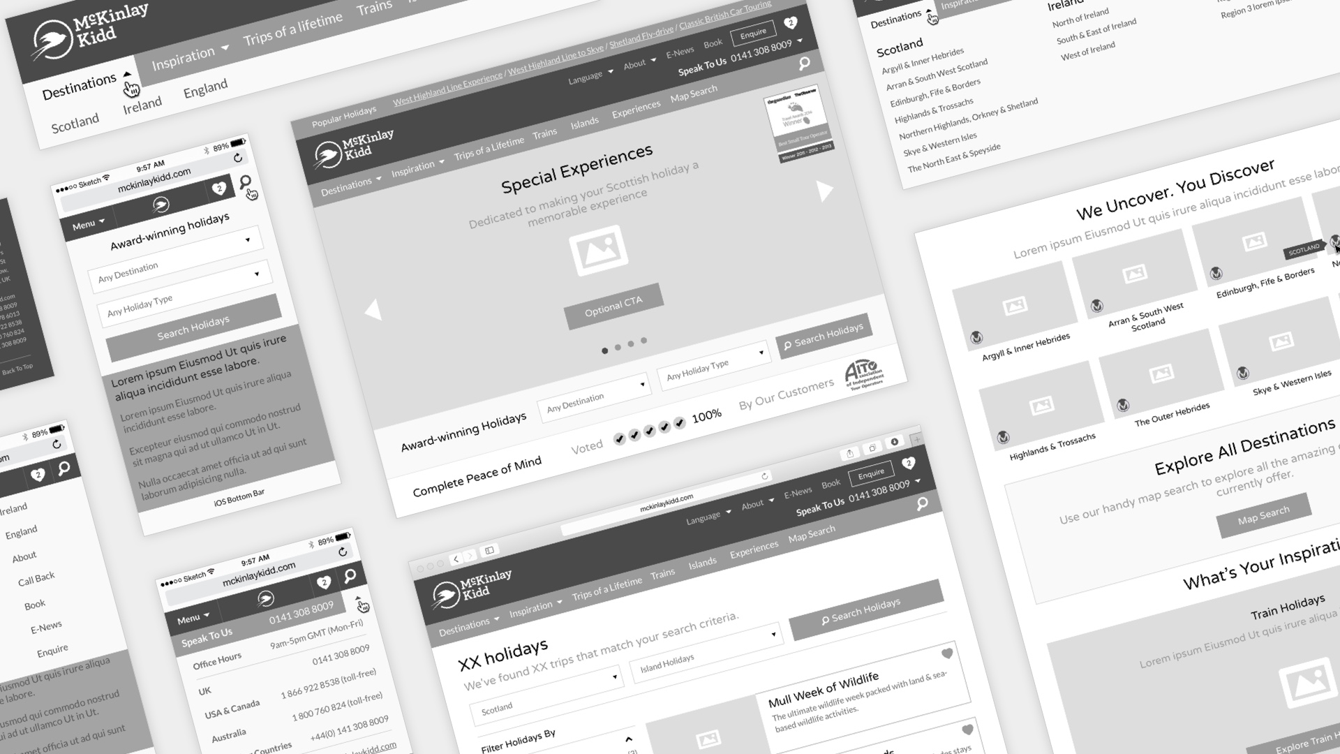
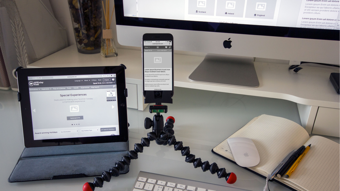
Once all back-end functional modules and HTML templates were complete, I was able to concentrate on how content would be structured within each template.
Although I rarely create wireframes these days, I decided the client would benefit from seeing something a little more tangible than just abstract HTML.
UI Design
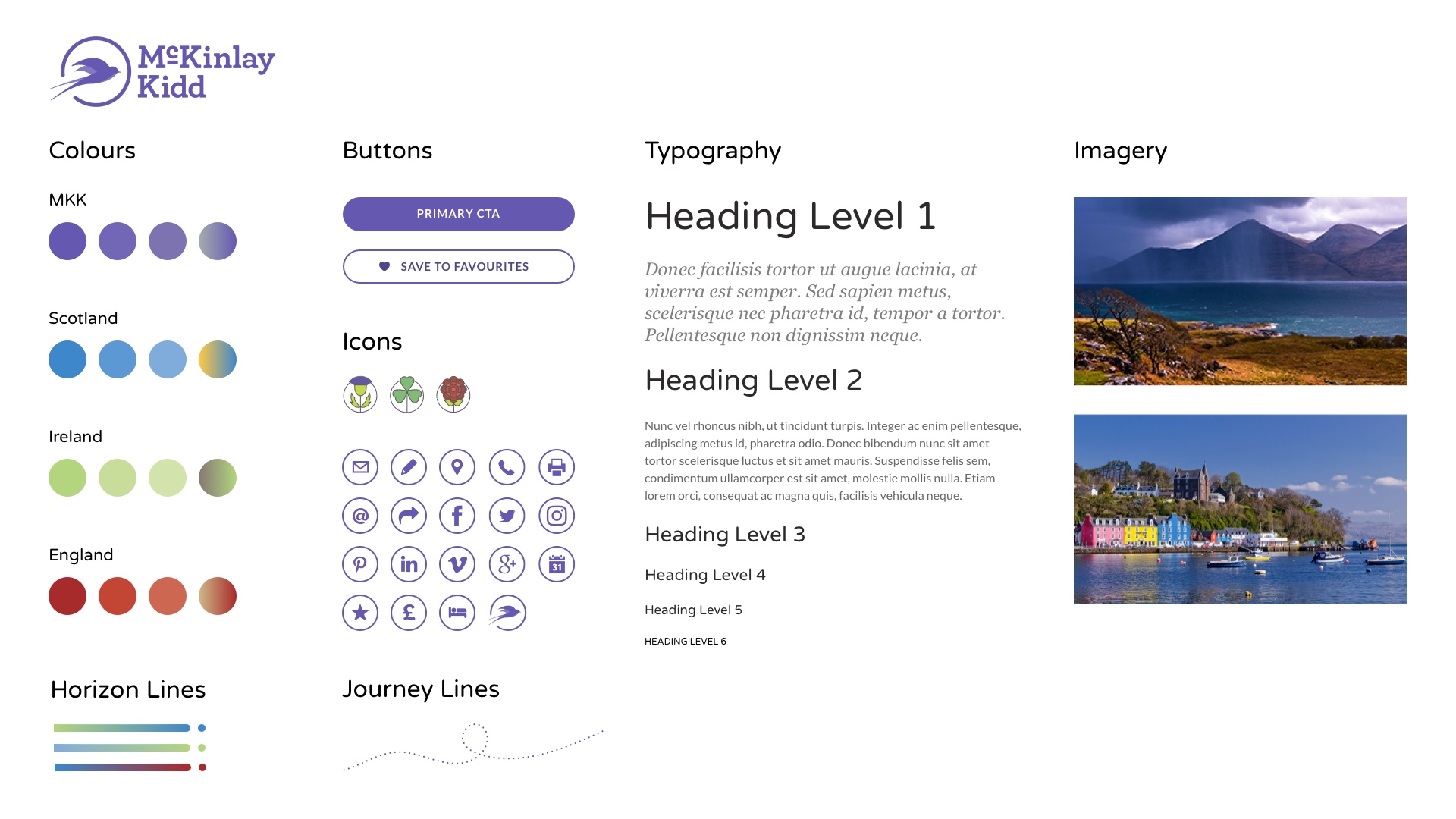
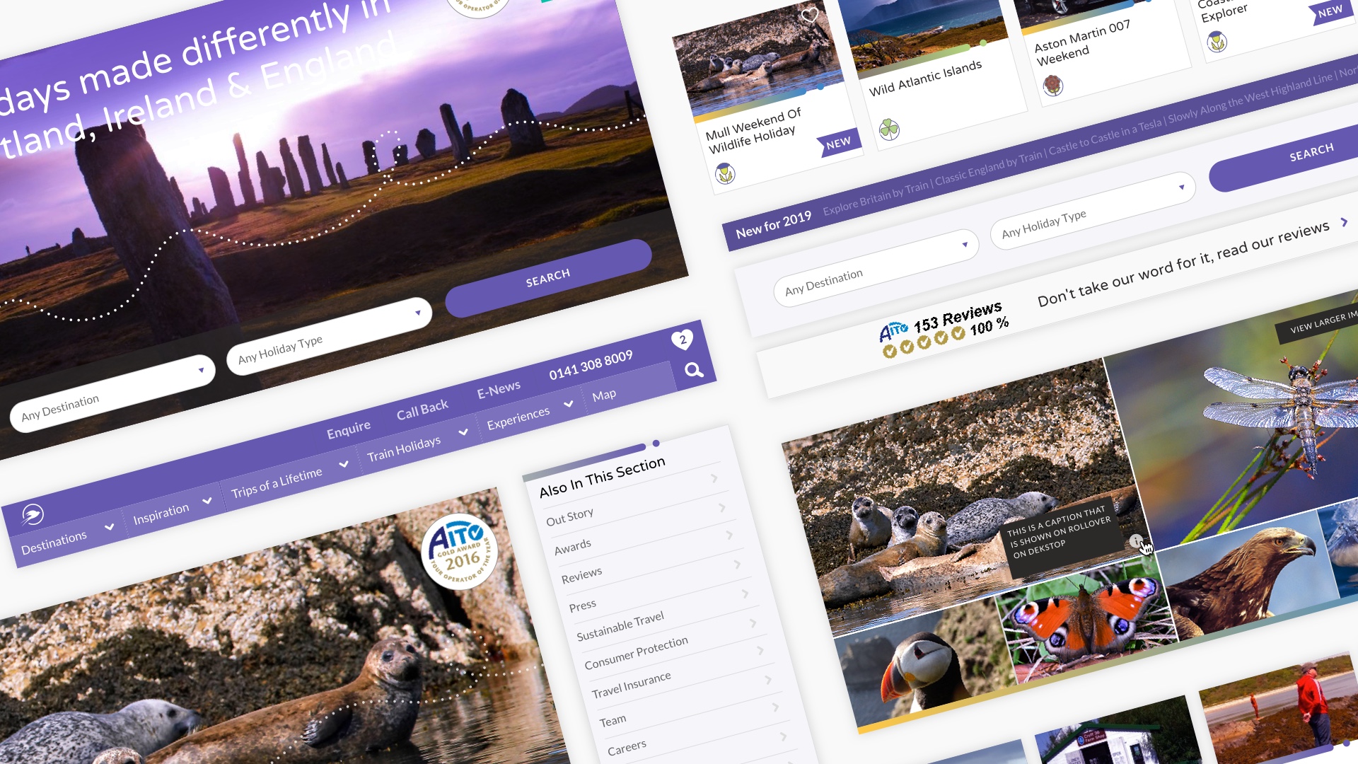
Once all visual assets had been completed by brand agency Made Brave, I was able to use my wireframe document as a starting point for the visual design of the UI.
This saved a lot of time. Instead of having to redraw the assets, I reused shared styles and symbols and I was able to rapidly apply the brand to the wireframes.
Once all visual assets had been completed by brand agency Made Brave, I was able to use my wireframe document as a starting point for visual design of the UI.
This saved a lot of time. Instead of having to redraw the assets, I reused shared styles and symbols and I was able to rapidly apply the brand to the wireframes.
Front-end Development
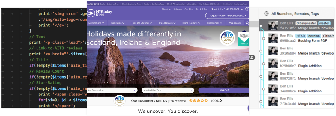
I developed the front end using a custom installation of Foundation 6, select JavaScript plugins and hand-coded HTML, SCSS and JavaScript.
My development environment included Sublime Text, Codekit, Tower, MAMP, iTerm and GitLab. I developed locally and then mapped a GIT development branch to my staging server and master branch to the live server.
The client had access to the staging environment and I would push changes for preview and approval. Once signed off, the development branch was merged into master and the site was pushed live.
This setup allowed me to make ongoing updates to the live site. When a change request came in, I simply made the amends, pushed them to development and once the client was happy I simply merged and pushed to live.
I developed the front end using a custom installation of Foundation 6, select JavaScript plugins and hand-coded app.scss and app.js components.
My development environment included Sublime Text, Codekit, Tower, MAMP, iTerm and GitLab. I developed on localhost and then mapped a GIT development branch to my staging server and master branch to the live server.
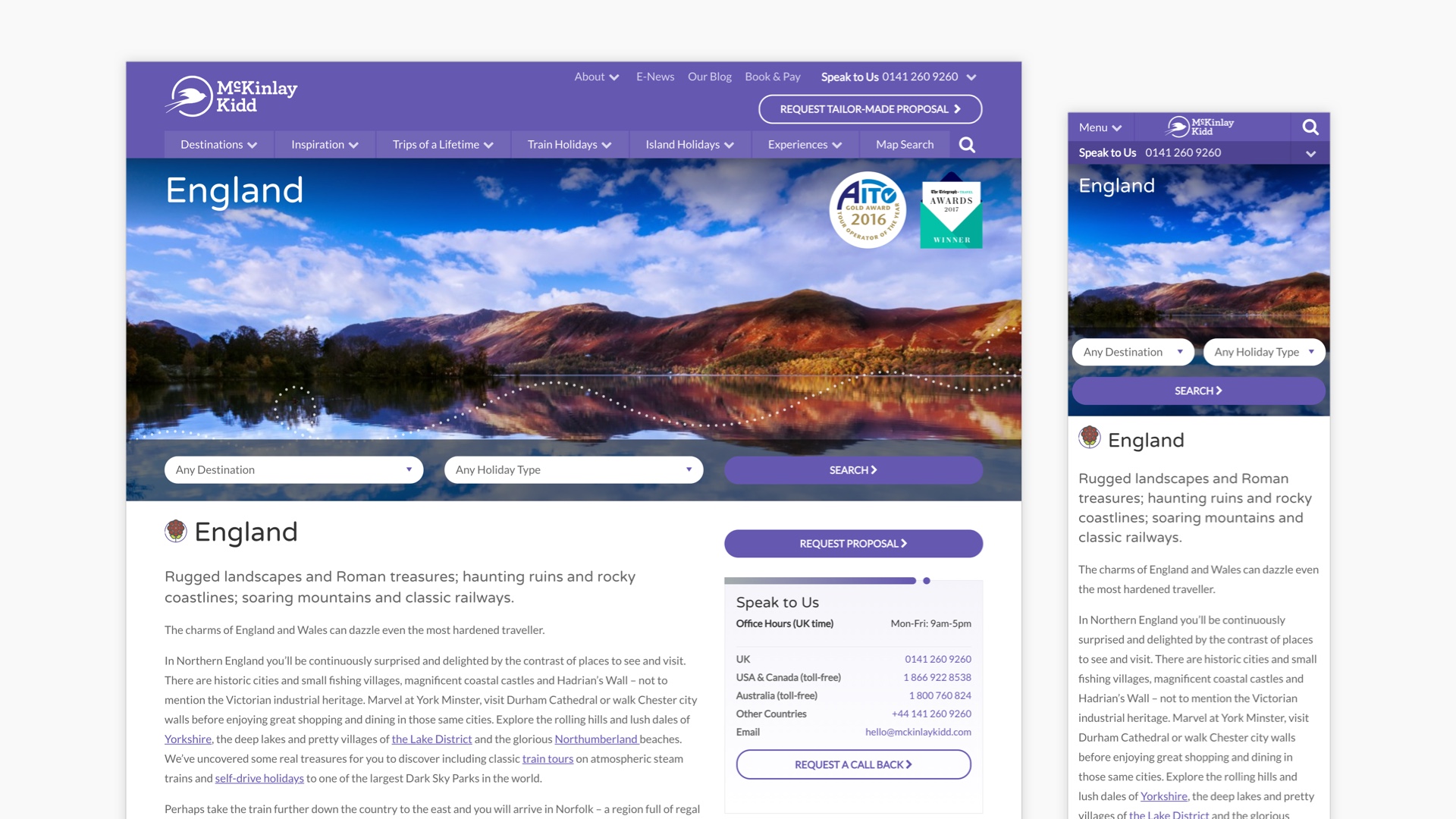
Final Website
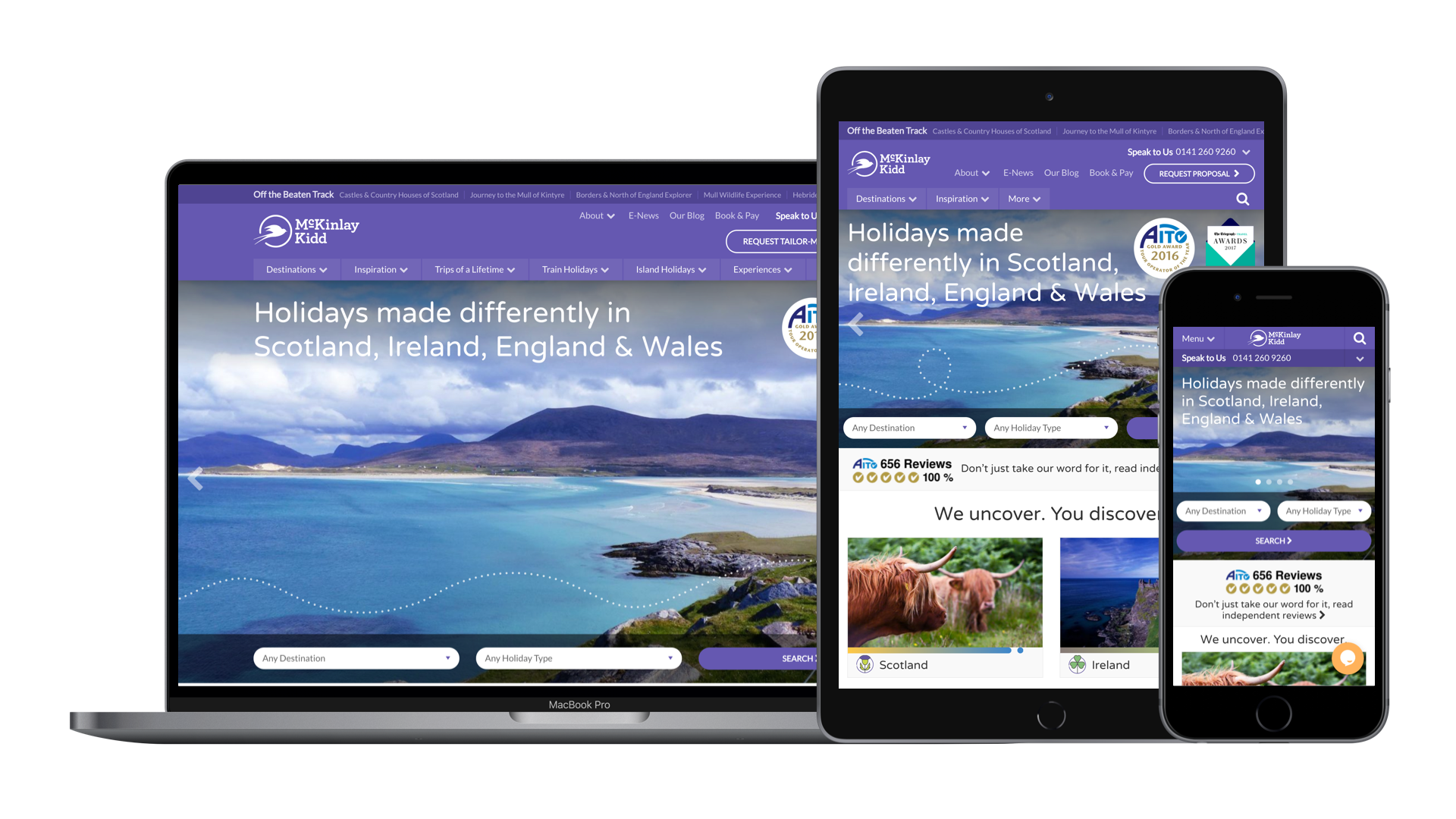
The site was launched at the end of March 2016 and so far has received positive feedback from both the client and customers.
Testimonial

Robert Kidd
Founder McKinlay Kidd
“We first worked with Ben nearly 15 years ago when he designed our new company's very first website. It is a testament to the quality of service and creativity he offers that he is still a valuable business partner.”