- URL: ourplanet.com
- Client: WWF
- Agency: B-Reel (London)
- Date: July-August 2018
- Duration: 6 weeks
- My Role: UX Designer
- Deliverables: Sitemap, user flows, wireframes, prototype
Awards
Webby Award - People's Voice Winner 2020 (TV & Film Websites)
Our Planet is an Emmy-winning documentary that explores the world's natural wonders and reveals the key issues that threaten their existence.
Narrated by David Attenborough, the series is the result of a four-year collaboration between Netflix, Silverback Films and the WWF.
To further its reach, Netflix and the WWF wanted to utilise digital platforms to drive awareness and further engage users to take action.
An essential part of this ecosystem was the Our Planet website. I worked at B-Reel London to help them shape it's UX.
Project Onboarding
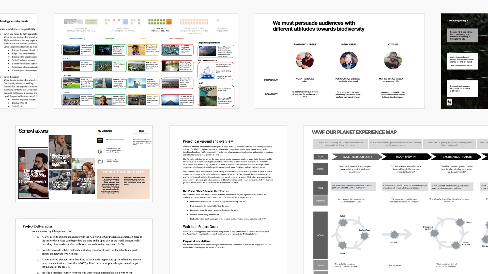
With a production of this size, a great deal of work had already been undertaken before I joined the project. One of the key initial challenges was to read through and make sense of the mountain of documentation that had been created.
As with most agency-run projects, timelines were tight. The challenge was not to read every document that was passed to me but to decipher which contained the most relevant information to confidently lay the foundations for the UX.
At this stage of the project, I was most interested in understanding the project goals, audience, content structure, publishing schedule and technical limitations.
Below is a selection of the project onboarding materials including content outline, user personas, experience maps and technical requirements.
Journey Mapping
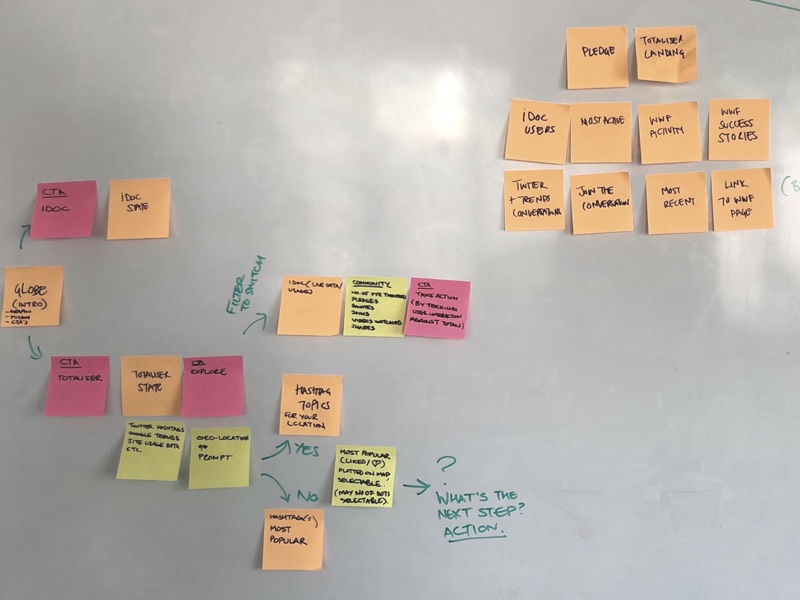
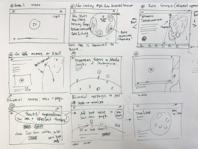
The pre-existing documentation gave me a great starting point on which to base the UX discovery process. As part of the B-Reel design team, I helped identify key user actions and mapped out journeys and a site structure that would ensure these could be achieved.
The examples below show two sessions where user journeys through the interactive globe experience were developed. The first in low-fidelity using Post-It Notes and subsequently with whiteboard sketches.
Architecture & Taxonomy
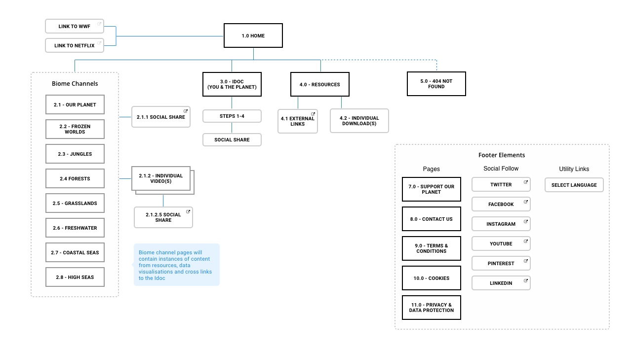
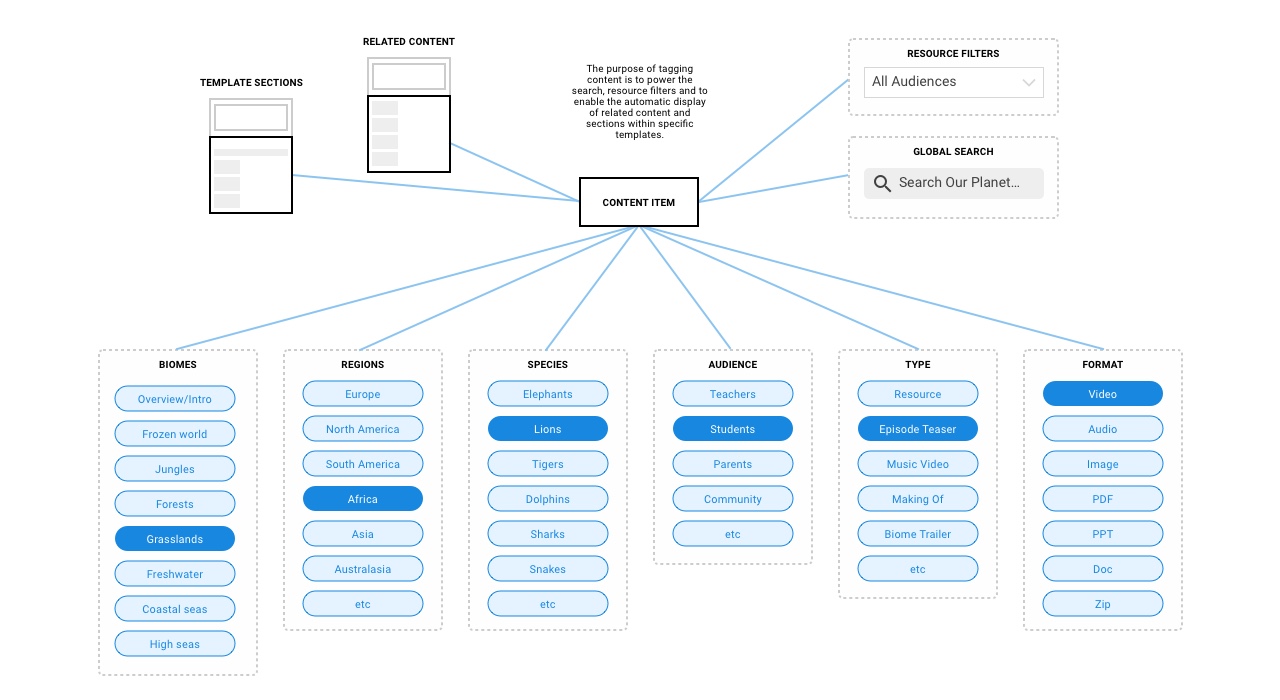
Once I'd had time to absorb the project onboarding material and develop initial flows with the design team I drafted the site architecture. Alongside this, I also developed the content taxonomy that provided the backbone for the search and also for linking items from different sections of the site.
As with most projects the site architecture went through various iterations before the client was happy to sign it off.
Wireframes
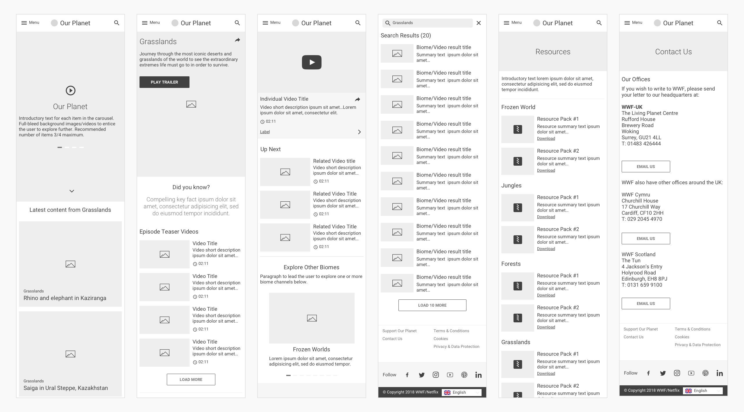
I then developed a set of wireframes for key areas of the site. These provided both the client and the design team detailed content hierarchy for each section. They also allowed us to develop a low-fidelity prototype to test key user journeys through the site architecture. Again I went through multiple iterations with the client to refine the structure before final sign off.
Navigation Prototype
I validated the site navigation and key journeys on-device using Sketch's basic, built-in prototyping functionality.
Additional coded prototypes for features such as the explorable globe were developed by the tech team to understand technical feasibility.
UI Design
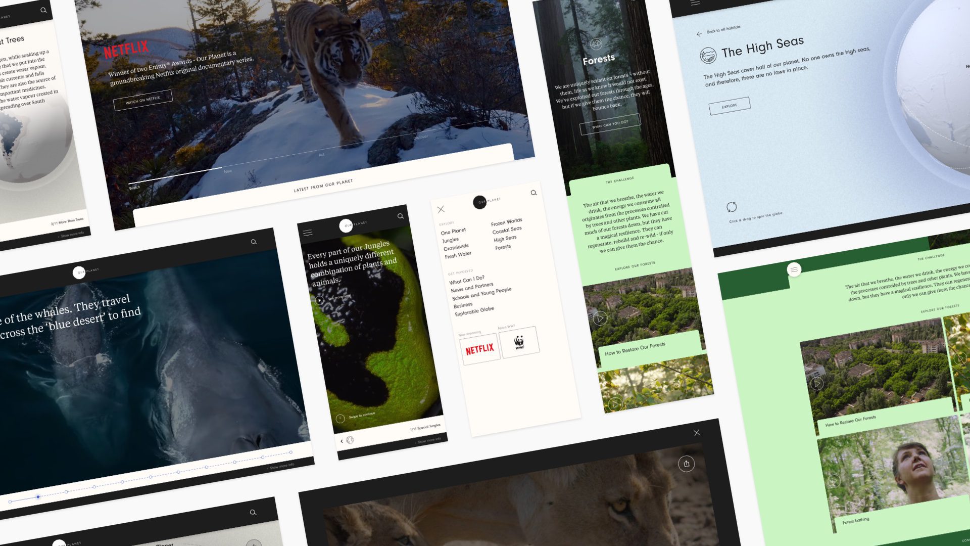
Roma Levin led the UI design. I worked closely with him to ensure it complemented my UX. Again this was an iterative process, presenting key rounds to the client prior to final approval.
A few of Roma's designs can be seen below.
CMS Design
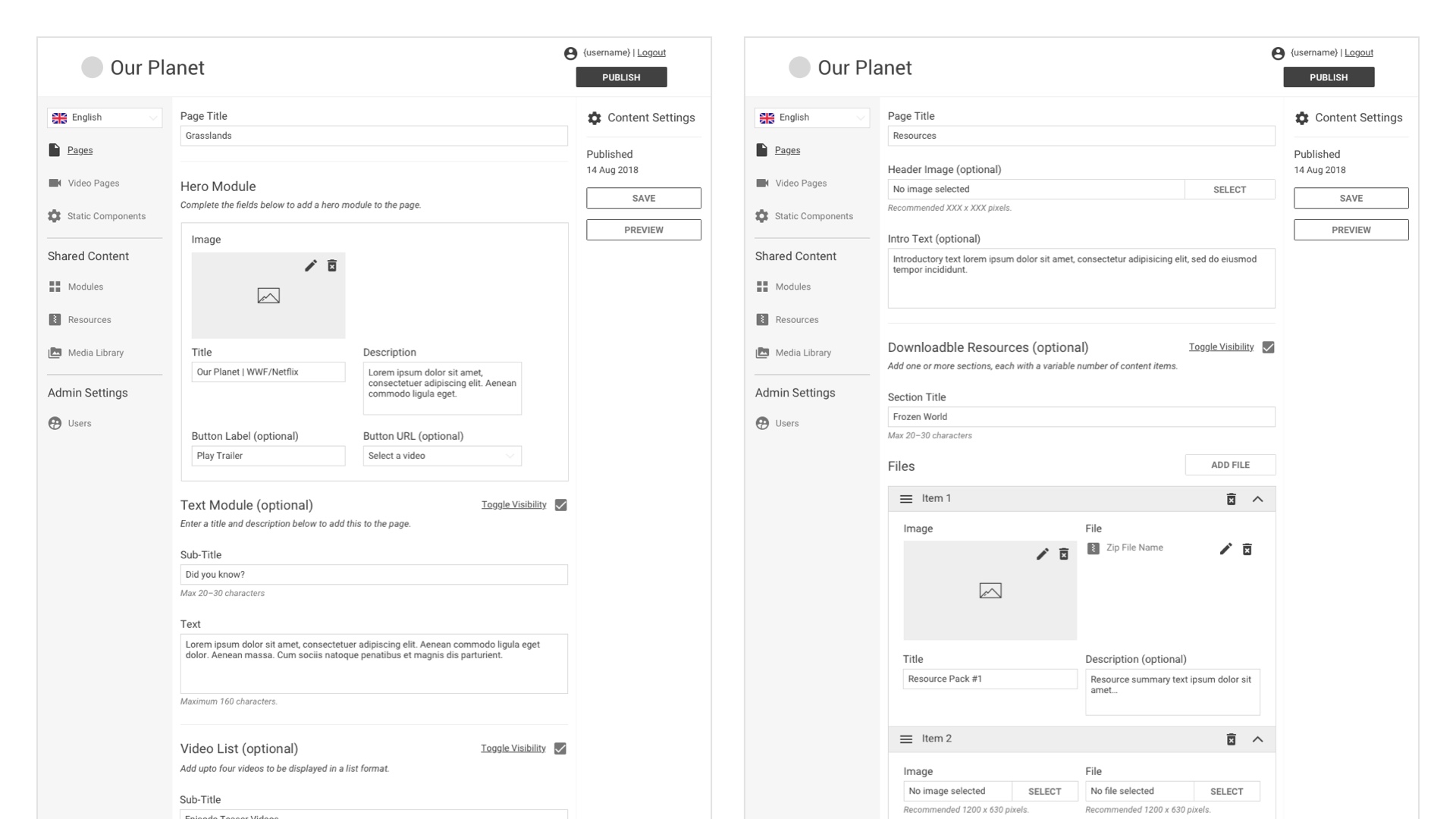
One of the client's requirement was for the site to be fully content managed. B-Reel Barcelona developed a bespoke, headless CMS and I helped them define it's UX.
Working closely with the B-Reel tech team I developed a key set of wireframes for each section of the CMS. They provided essential structural information for the developers and also ensured a usable CMS for the client.
Initial Results
The site received the following stats during its first three weeks of being live:
1.5M Unique Visits
110K Explorable Globe Completions
50K Sign-ups (70% conversion)
370K Referrals to WWF website