With the continued rise of the responsive web and the increasing number of connected devices, the way in which we design, develop and communicate the user experience has had to change.
Gone are the days when static wireframes would cut the mustard. We are now in a new era of using a combination of user/technical flows, hand sketching and then developing functional prototypes in HTML.
Karmarama
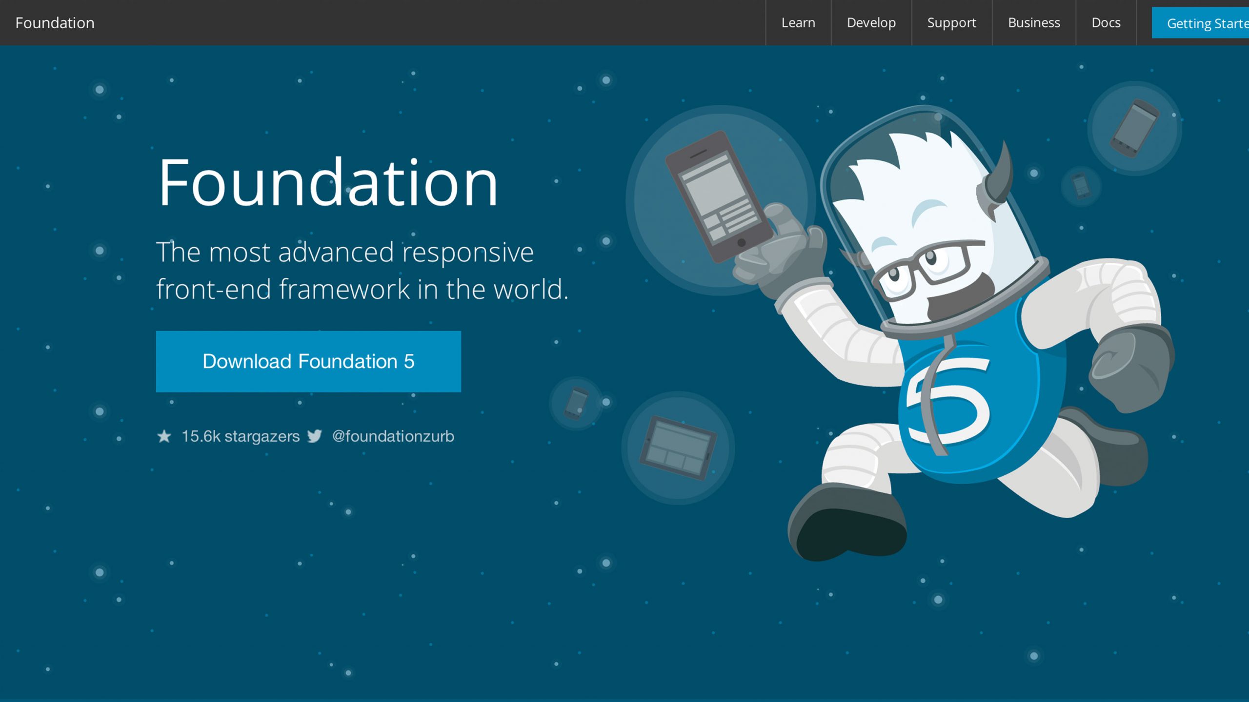
Whilst working on a recent project at digital agency Karmarama, I thought I would give Foundation 5 a try to help me prototype some of the responsive behaviour for a particular site.
Foundation is very similar to Bootstrap: it has a responsive grid, a set of nicely styled UI components, icon fonts and a bunch of clever JavaScript plugins.
What I found particularly helpful was Interchange.
Interchange
Interchange is a JavaScript component that allows you to include specific content into your design at specific breakpoint(s).
What this effectively means is that you can go much further than just having a responsive grid and images that scale to your device. You can tailor your entire site content (and potentially functionality) specifically to the device.
The reason you would want to do this is that people use different devices in different ways, so anything you can do to optimise and enrich their experience on that device will improve their experience.
For example you might have an off canvas style navigation that is particularly useful on a mobile experience (as it saves screen real estate), but you want to optimise the navigation on tablet in a different way. You also may want to further optimise the navigation on desktop in a slightly different way.
With Interchange you simply create one of more snippets of HTML and then include a snippet of JavaScript in the page pointing to each one, along with a fallback and you are done.
It is a great way to rapidly test navigation approaches and weed out any glitches at early stages. Interchange can also be used for serving up different source files for images, so that you load in the smallest by default and then scale up accordingly.
The other great advantage of using Foundation is the clean markup. Here at Karmarama we are trying to reuse snippets of the prototype code where possible and move them into full-on production. This should save time and money and result in a smaller gap between the UX and design vision and the end result.
Next steps
We are still in the early stages of adopting this style of working, so I'll report back in a few months to let you know how we are getting on.
Until then, I urge you to check out both Bootstrap and Foundation and read the article on responsive prototyping on A List Apart.


