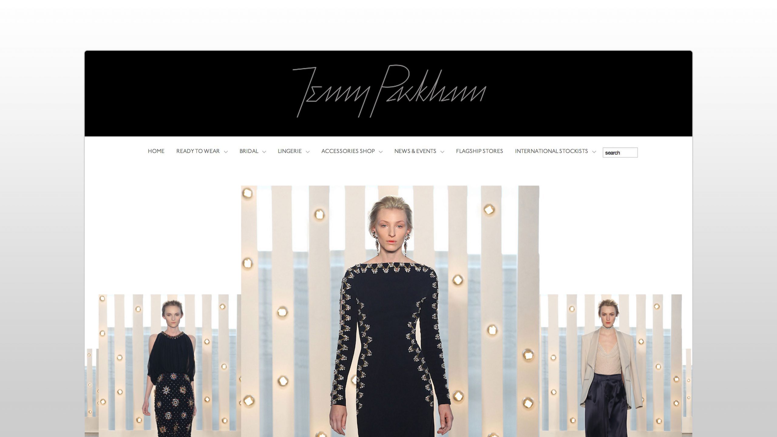
Over the past week or so I have been looking at fashion websites as part of a pitch that I have been working on. In particular the website of fashion designer Jenny Packham.
Whereas I don't really have a great interest in women's fashion (let alone bridal and ready to wear collections), what did grab my attention was how poorly optimised the current website was.
Two of the worst offending pages were the Ready to Wear collection page and the Red carpet gallery blog page.
The first weighed in at 16.9MB, which in itself is bad enough. Combined that with a poorly designed image gallery and you've got your first UX no no.
The second weighed in at a whopping (wait for it) 58.6MB. Having a quick peek at the code it turns out that some clever soul decided to not to resize the 300x438 px images before they uploaded them, but just included them at 960x1400px and instead rely on the HTML to resize them. No wonder the page weighed so much.
In an era of fibre-optic broadband and 4G connections, you might think that page optimisation might be less of a concern to site owners. Well you'd be wrong.
Connection speeds still vary greatly, depending on the time of day, distance from a telephone exchange, strength of mobile signal and so on. If you viewed a few of the above pages on your mobile, you'd pretty much chew through your entire data plan during the first visit to the website. That's if you bothered to stick around and wait over a minute (yes thats how long it took to load) for the page to render.
It doesn't matter how amazing your dresses are, you can't expect people to sit around for a minute for the page to load.
So the lesson here is run your images through Photoshop and Save For Web or use another batch processing tool like Automator. Use Grunt to automatically minify assets before they are delivered to the client and then send them using HTTP compression.
This isn't an optimisation 101, so if you want to find out more about it then check out Google's article on Web Performance Best Practices and start using Chrome's DevTools and Google's PageSpeed Tools.
Don't worry, if we win the pitch we'll be taking care of the optimisation issue so any potential rich brides-to-be can browse beautiful designer dresses to their hearts content.


